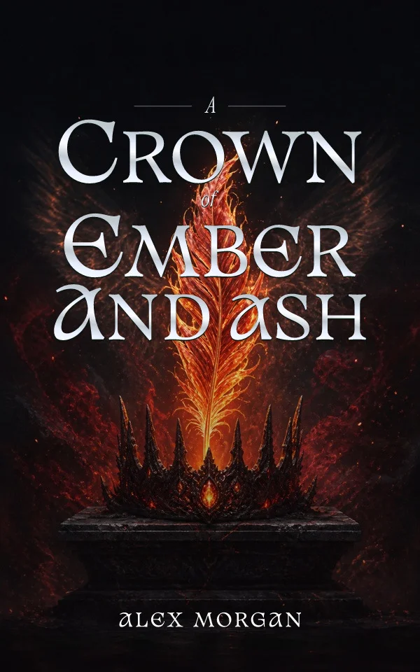
Readers often encounter a cover as a small tile beside dozens of alternatives. At that scale, fine detail disappears first. What survives is the title silhouette, dominant contrast, and one memorable image. The thumbnail test reveals whether the composition still communicates before a reader opens the product page.
Protect one visual idea
A face, object, silhouette, unusual crop, or bold graphic relationship can survive reduction. Five equally important details turn into texture. Decide what the reader should recognize before every word is legible, then let secondary elements support that idea rather than compete with it.
Judge the title as a shape
Line breaks, width, scale, and spacing form a silhouette before the title is read. Shrink the cover and look away for a moment: the first readable shape should be intentional. A subtitle or series line can disappear at marketplace size without failing, but it must not fragment the main title on the way down.
Create contrast before adding effects
Contrast can come from value, color, weight, size, width, negative space, or a low-detail part of the artwork. Shadows and overlays are useful when they solve a specific collision. If every line needs a heavy glow, the crop or hierarchy probably needs attention first.
Compare in the correct shelf context
A cover is not judged in isolation. Place the thumbnail beside current books aimed at the same reader. It should signal the right category while retaining a distinct focal idea. If only the author name, border, or unrelated decorative line survives, return to the composition instead of simply enlarging every element.
By Coverfairy Editorial · Published · Updated