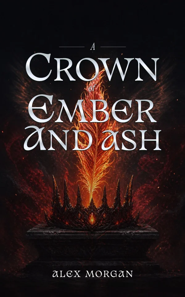
Cormorant Garamond + Manrope
Literary scale with a disciplined supporting voice.
Pairing 01 · title + author or subtitle

Compare serif, sans serif, condensed, display, and script systems at real cover scale.
How many fonts should a book cover use?One display family and one supporting family are usually enough; multiple weights within those families can create the full hierarchy.
Enter your title once to see how it looks in each font pairing.
Literary scale with a disciplined supporting voice.
Pairing 01 · title + author or subtitle
Editorial contrast for fashion, history, and dramatic fiction.
Pairing 02 · title + author or subtitle
Condensed impact balanced by a warmer serif.
Pairing 03 · title + author or subtitle
Contemporary personality without sacrificing small text.
Pairing 04 · title + author or subtitle
Engraved capitals with a neutral information layer.
Pairing 05 · title + author or subtitle
Modern authority softened by a literary secondary face.
Pairing 06 · title + author or subtitle
Elegant display rhythm with practical supporting copy.
Pairing 07 · title + author or subtitle
An italic-capable title face with crisp metadata.
Pairing 08 · title + author or subtitle
Test the actual title and author name together. Choose a style that fits your genre and stays readable when the cover is small.
Start with the title's job. A short thriller title may need width and mass; a long memoir title needs graceful compression and reliable lowercase; a practical nonfiction cover often benefits from direct sans serif authority. Choose a family because its letter shapes support the reading experience, not because the font looks attractive in an isolated specimen.
Treat the title as a composition before treating it as a sentence. Line breaks, width, tracking, case, and leading determine the silhouette that survives a retailer grid. Test the most difficult letters in the real title, including punctuation and repeated capitals. A pairing that works for a placeholder may fail once the author's actual words produce awkward gaps.
Use a second family only when it has a clear role. Subtitles, series lines, endorsements, and author names need consistency more than novelty. Check commercial licensing, character coverage, embedding, and export reliability before committing. Decorative display fonts often lack the punctuation, accented characters, or stable PDF outlines required by a complete publishing workflow.
Compare two or three choices on the complete cover before deciding. Check every word, including the author name and any subtitle. Finish by shrinking the complete cover to roughly the size it will occupy in a search result. Remove effects one at a time and confirm that the hierarchy still works in plain type. Shadows, outlines, texture, and metallic treatments should strengthen an already legible composition; they should never be the only reason a word can be read.
Favor moderate contrast, flexible lowercase, and deliberate multi-line rhythm.
Test a wide or condensed face at maximum silhouette before adding effects.
Build authority with weight, spacing, and an explicit supporting hierarchy.
No. Verify the exact license for commercial use, modification, embedding, and the version you downloaded.
It can, but a supporting face often makes the hierarchy clearer and easier to repeat across a series.
Start from your story, then try editable typography and artwork. Examples made with the Coverfairy editor: