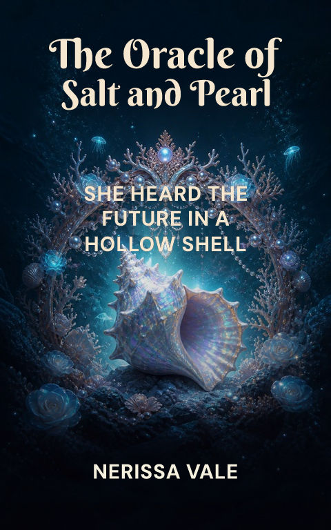
Berkshire Swash + DM Sans
Lyrical curves for sea magic, prophecy, and romantic relics.
Pairing 01 · title + author or subtitle

Preview eight distinctive fantasy display faces, then see each pairing on an editable original cover.
Do fantasy covers need medieval fonts?No. Readers need a clear world and tone; modern serif or sans serif systems can signal fantasy through scale, composition, and imagery.
Enter your title once to see how it looks in each font pairing.
Lyrical curves for sea magic, prophecy, and romantic relics.
Pairing 01 · title + author or subtitle
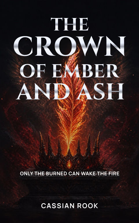
Tall old-world forms for fire, dynasties, and dangerous crowns.
Pairing 02 · title + author or subtitle
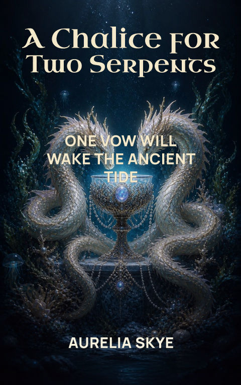
Carved manuscript character for ancient courts and enchanted oaths.
Pairing 03 · title + author or subtitle
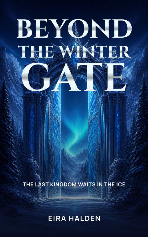
Classical restraint for gates, kingdoms, and monumental landscapes.
Pairing 04 · title + author or subtitle
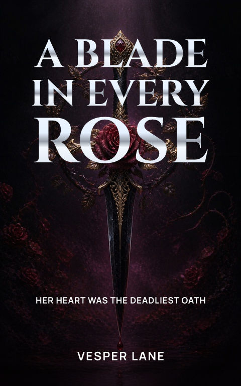
Expressive calligraphic tension for dark romantasy and botanical danger.
Pairing 05 · title + author or subtitle
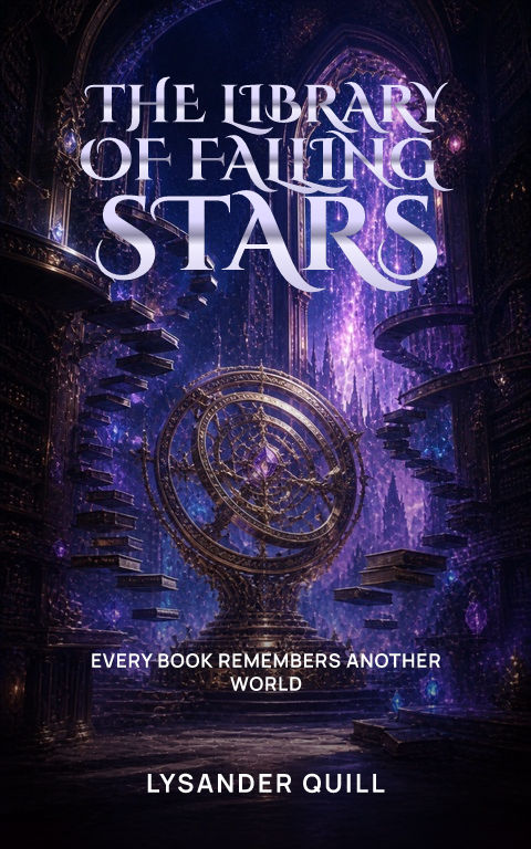
Ornamental capitals for celestial archives and formal magic.
Pairing 06 · title + author or subtitle
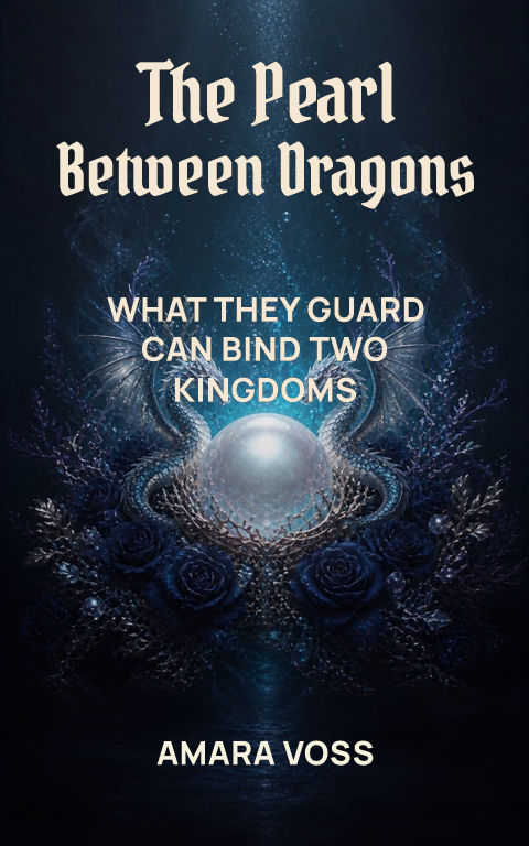
Strong storybook character for sea dragons, treasure, and adventure.
Pairing 07 · title + author or subtitle
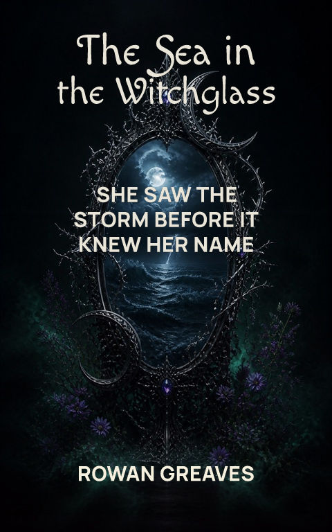
Unusual swash forms for witchcraft, mirrors, and gothic folklore.
Pairing 08 · title + author or subtitle
These are original editable covers, not isolated alphabet samples. Open any one to change the title, pairing, artwork, and color.
Test the actual title and author name together. Choose a style that fits your genre and stays readable when the cover is small.
Fantasy typography has to suggest a world without becoming costume lettering. Begin with the book's dominant promise: mythic scale, intimate magic, dangerous court politics, folklore, military action, or romantic tension. An engraved capital face may suit a dynasty but feel remote on a character-led woodland story. Let the premise choose the typographic temperature.
Ornament belongs around the hierarchy, not inside every letter. Swashes, carved details, metallic textures, and celestial marks can reinforce the setting when one motif leads. They become noise when thin strokes collide with crowns, weapons, branches, or stars. Preserve a calm title field and test the word shapes at thumbnail size before approving decorative detail.
Series recognition should come from a repeatable title architecture, author position, spacing rule, and supporting family. The display face can remain consistent while each book changes its symbol and color. Check that Roman numerals, apostrophes, accented character names, and long sequel titles are supported before building the entire series around one font.
Compare two or three choices on the complete cover before deciding. Check every word, including the author name and any subtitle. Finish by shrinking the complete cover to roughly the size it will occupy in a search result. Remove effects one at a time and confirm that the hierarchy still works in plain type. Shadows, outlines, texture, and metallic treatments should strengthen an already legible composition; they should never be the only reason a word can be read.
Use engraved capitals, generous tracking, and one restrained sigil.
Choose warmer serifs and let uneven organic shapes live in the illustration.
Pair elegant contrast with enough weight to survive jewel-toned, detailed art.
Use them for short display lines with generous space, not for blurbs, subtitles, or dense series information.
Yes. Keep the type architecture consistent and vary the central art, palette, or motif for each volume.