Space Grotesk + Manrope
Direct modern authority with a highly readable subtitle voice.
Pairing 01 · title + author or subtitle

Test authoritative sans, editorial serif, bold display, and highly readable subtitle pairings with your real title.
Should a nonfiction cover use a sans serif font?Not always. Sans serif can feel direct and modern; editorial serif systems can better suit history, essays, biography, culture, or reflective subjects.
Enter your title once to see how it looks in each font pairing.
Direct modern authority with a highly readable subtitle voice.
Pairing 01 · title + author or subtitle
Condensed billboard impact for business, performance, and practical titles.
Pairing 02 · title + author or subtitle
Warm expertise for health, psychology, relationships, and accessible ideas.
Pairing 03 · title + author or subtitle
Editorial contrast for culture, fashion, history, and thought leadership.
Pairing 04 · title + author or subtitle
Reflective authority for essays, biography, and narrative nonfiction.
Pairing 05 · title + author or subtitle
Formal display capitals with a neutral evidence-led information layer.
Pairing 06 · title + author or subtitle
Urgent narrow headlines balanced by a human supporting serif.
Pairing 07 · title + author or subtitle
Publishing tradition paired with a clear contemporary subtitle.
Pairing 08 · title + author or subtitle
Test the actual title and author name together. Choose a style that fits your genre and stays readable when the cover is small.
Nonfiction typography has to make the promise legible before it makes the cover impressive. Business and practical books often benefit from broad sans serif authority or condensed display scale; narrative history, essays, and cultural criticism may need a more editorial serif voice. Choose the tone the reader should trust: direct, rigorous, warm, disruptive, or reflective. Then make the type architecture demonstrate it.
The subtitle is a structural element, not footnote copy. Test the real title and subtitle together because a pairing that looks confident with three sample words can become weak when it has to support a long outcome statement. Keep line length controlled, preserve clear space, and create enough contrast for the subtitle to read at full size even when it is allowed to recede at marketplace-thumbnail size.
Credentials, edition lines, endorsements, and series marks create additional hierarchy pressure. Give each item a defined role rather than shrinking everything into the remaining space. A strong nonfiction system usually has one dominant promise, one explanatory layer, and one subordinate author or authority layer. Repeat those roles across a series while changing the central concept, color, or subject-specific visual.
Compare two or three choices on the complete cover before deciding. Check every word, including the author name and any subtitle. Finish by shrinking the complete cover to roughly the size it will occupy in a search result. Remove effects one at a time and confirm that the hierarchy still works in plain type. Shadows, outlines, texture, and metallic treatments should strengthen an already legible composition; they should never be the only reason a word can be read.
Use large direct type, a decisive color field, and a concise subtitle grid.
Balance credible structure with warmer curves and comfortable supporting text.
Use editorial serif detail with enough scale and contrast to avoid looking academic or remote.
It should remain comfortably readable on the full cover and print proof, even if some detail recedes in a small storefront thumbnail.
Only when they materially support trust. Keep them subordinate to the title and reader promise.
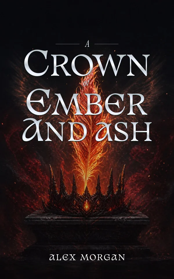
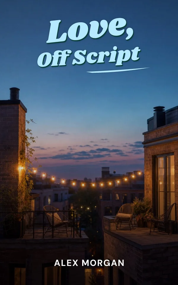
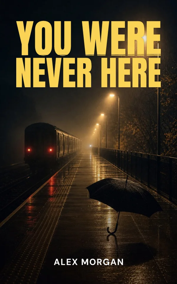
Start from your story, then try editable typography and artwork. Examples made with the Coverfairy editor: