
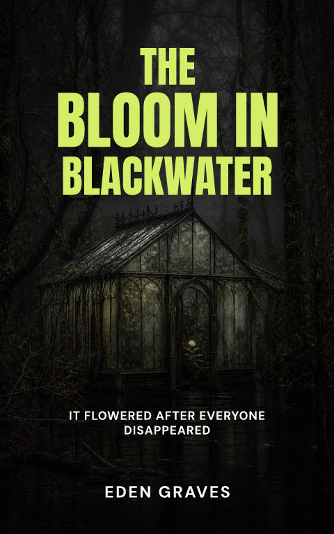
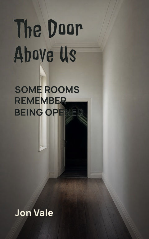
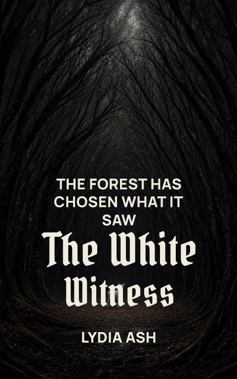
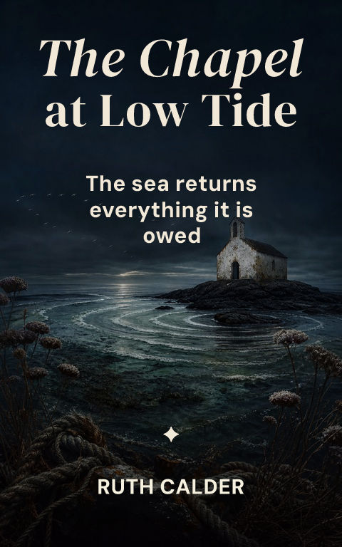
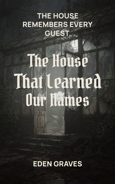
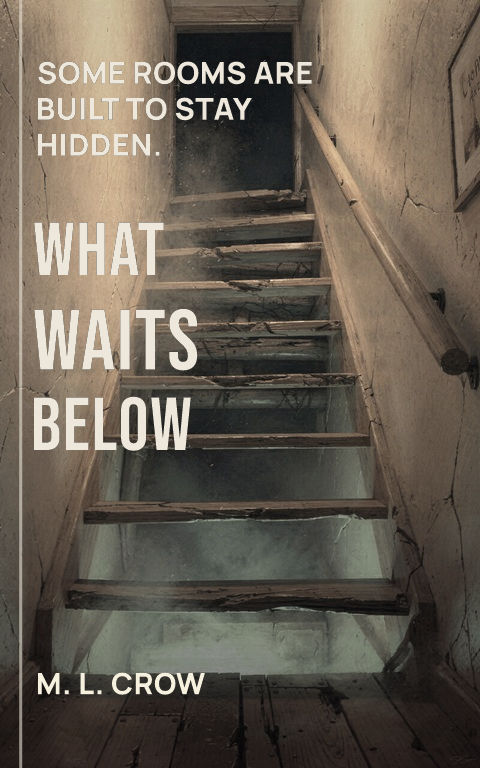
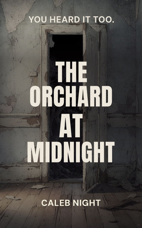
Uncanny domestic
Distort one familiar room or object instead of filling the frame with threat.

Build around dread, transgression, and the shape of the threat. Start with eight distinct directions, then replace the art and edit every type layer.
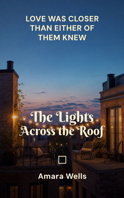
How do you make a horror book cover?Start from dread, transgression, and the shape of the threat, then keep the title, subtitle, author, and series lines as editable typography over replaceable artwork. A watermarked draft is free; an active pass unlocks the full-resolution ebook file, calculated KDP print wrap, and Interior exports.
Choose a template to open it with editable type and artwork.
Horror is strongest when the cover establishes unease before it reveals the threat. Use absence, impossible scale, corrupted domestic detail, or an uncanny figure rather than relying on gore. One area of sharp contrast gives the eye somewhere to land and keeps the cover from collapsing at small sizes.
Typography can be severe, elegant, handmade, or clinical depending on the subgenre. The best choice reinforces the source of fear. Keep distressed effects large enough to survive compression, and avoid layering thin type over branches, hair, or scratched textures.
For print, use the spine to continue a crack, shadow, hallway, or color field. The back needs enough calm for a readable blurb and review quotes. Coverfairy's overlay controls can reduce artwork contrast without flattening it.
Check the cover at storefront size: the title and focal image should still read clearly. For print, keep important details away from trim and leave a calm back-cover area for copy and barcode.
Distort one familiar room or object instead of filling the frame with threat.
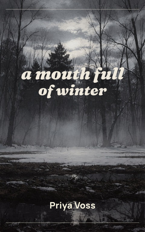
Use landscape, ritual geometry, and a restricted natural palette.
Crop abstractly and imply transformation without losing bookstore suitability.
Yes. Illustration, photography, portraiture, objects, and abstract art are supported.
Yes. Crop, overlay, exposure treatment, and text shadow are editable.
Yes. Generated images are requested without lettering so typography stays editable.