

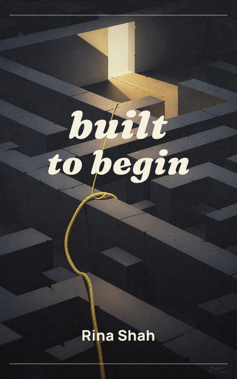
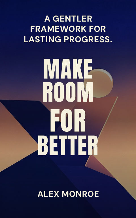
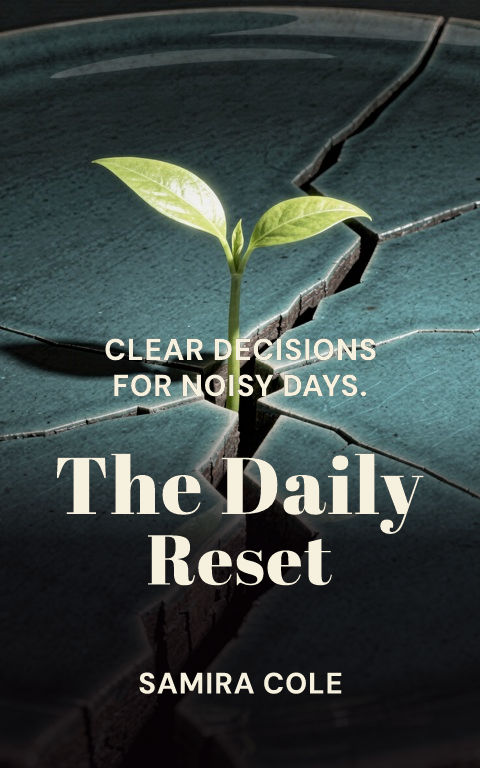
Promise-led type
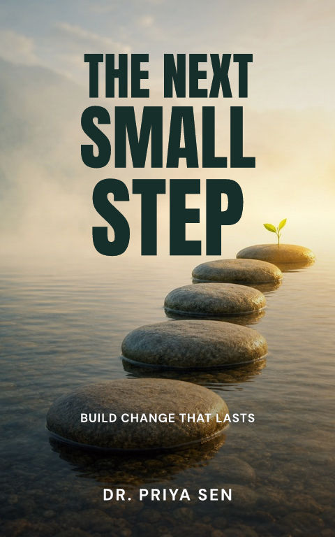
Let a short title dominate, then make the subtitle state the concrete outcome.

Build around a specific reader outcome, credible voice, and one memorable concept. Start with eight distinct directions, then replace the art and edit every type layer.
How do you make a nonfiction book cover?Start from a specific reader outcome, credible voice, and one memorable concept, then keep the title, subtitle, author, and series lines as editable typography over replaceable artwork. A watermarked draft is free; an active pass unlocks the full-resolution ebook file, calculated KDP print wrap, and Interior exports.
Choose a template to open it with editable type and artwork.
A nonfiction cover sells a useful promise before it sells atmosphere. Define the reader, the problem, and the result in one sentence, then decide whether the category expects authority, warmth, urgency, or intellectual curiosity. Business and big-idea books often work like billboards; practical, health, or relationship titles may need a more human visual voice. The category is broad, so a generic corporate surface is not a strategy.
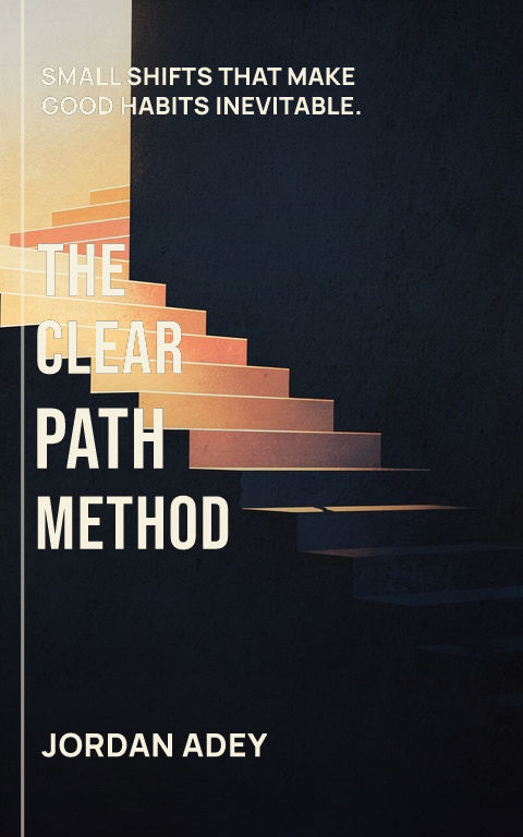
The subtitle carries more information than it does on most fiction covers. Build the hierarchy around the actual title and subtitle together: one should create curiosity, while the other makes the scope and outcome concrete. Use scale, width, weight, and negative space before relying on badges or decorative effects. Credentials can support trust, but they should not compete with the promise unless the author is already the primary reason readers buy.
Choose one visual concept that makes the subject easier to remember: a graphic metaphor, a transformed object, a bold typographic relationship, an editorial portrait, or a restrained diagram-like form. Avoid filling the front with literal icons for every chapter. For print, carry the system onto the spine and calm the back panel so the description, endorsements, author note, and barcode remain readable at actual size.
Check the cover at storefront size: the title and focal image should still read clearly. For print, keep important details away from trim and leave a calm back-cover area for copy and barcode.
Let a short title dominate, then make the subtitle state the concrete outcome.
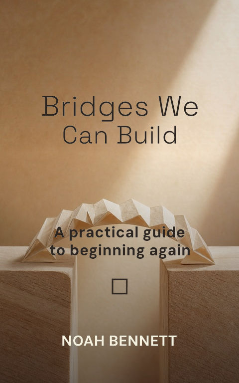
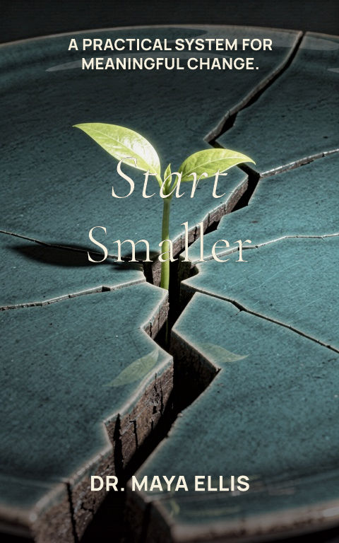
Use one altered object or graphic relationship to compress the book's central idea.
Pair a restrained portrait or editorial image with direct, readable type.
It usually needs to communicate the subject, reader, and practical or intellectual promise more explicitly.
Usually yes when it clarifies the audience, method, scope, or outcome; keep it subordinate but readable.
Yes. The title, subtitle, author, spine, back-cover copy, artwork, and print setup remain editable.