


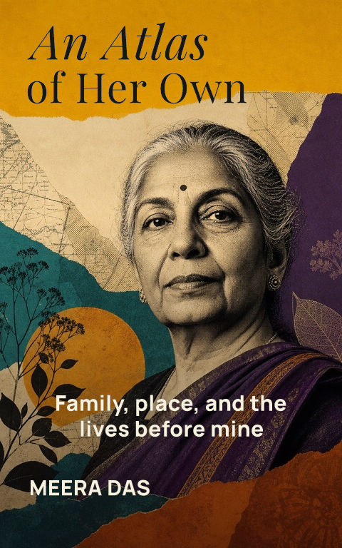
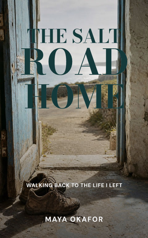

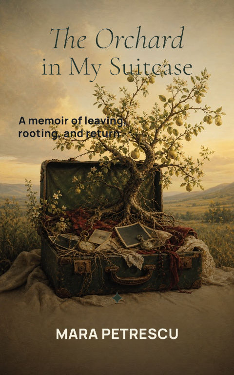
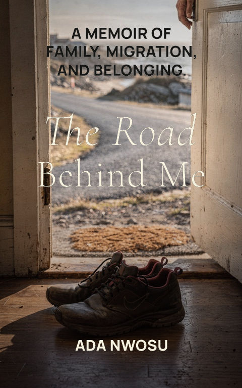
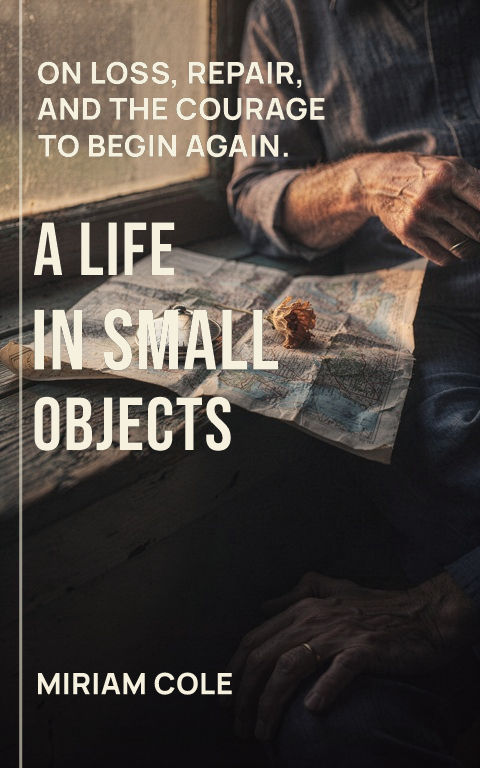
Archival fragment
Use one photograph or document detail with enough space for reflective typography.

Build around a specific life, emotional register, and reason to enter the story. Start with eight distinct directions, then replace the art and edit every type layer.
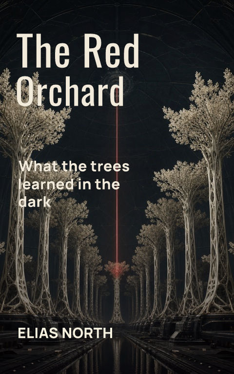
How do you make a memoir book cover?Start from a specific life, emotional register, and reason to enter the story, then keep the title, subtitle, author, and series lines as editable typography over replaceable artwork. A watermarked draft is free; an active pass unlocks the full-resolution ebook file, calculated KDP print wrap, and Interior exports.
Choose a template to open it with editable type and artwork.
A memoir cover should express the emotional truth and scope of the book without pretending to summarize a life. Begin with the central tension, belonging and departure, loss and recovery, family and identity, public achievement and private cost, then choose one image capable of holding that tension. An archival photograph can establish authenticity, but a symbolic object, place, collage, or illustrated detail may be more distinctive when no single portrait carries the story.
Typography acts like a voice. A warm serif can feel reflective, handwritten detail can suggest intimacy, and bold editorial type can suit humor, defiance, or high-energy experience. Handwriting should be used deliberately rather than as an automatic signal for something personal. Test the title, subtitle, and author name together; long explanatory subtitles need a calm field and enough size to remain useful beyond the full-resolution cover.
If the book uses family photographs or personal documents, record their source and permission before building the cover around them. Crop for meaning rather than decoration, and avoid placing the only recognizable face across a spine or trim. A series of related memoir, essay, or personal-development titles can repeat the title architecture and author treatment while each volume keeps its own memory, object, or place.
Check the cover at storefront size: the title and focal image should still read clearly. For print, keep important details away from trim and leave a calm back-cover area for copy and barcode.
Hire a genre specialist when the cover needs bespoke illustration, a precise character likeness, deep market interpretation, or a series identity with meaningful commercial stakes. As a budget reference, professional cover design on Reedsy's marketplace averaged $880 across collaborations completed in 2025, with most projects between $625 and $1,250; the cover design cost guide compares the current routes. Review portfolios aimed at the same readers and confirm concepts, revision rounds, image and font rights, print formats, and later spine changes in the quote.
Coverfairy is the author-operated option. The editor stays free while you test uploaded artwork and typography; a $6 Week Pass includes calculated KDP files, an ACX square, and every Interior export for 7 days. Choose this route when you want direct control. Move to a specialist when the brief needs more art direction than you can supply.
Use one photograph or document detail with enough space for reflective typography.
Choose an object whose condition or placement carries the book's central tension.
Layer place, memory, and time without turning the cover into a complete family album.
No. Portraits can establish identity, but symbolic, place-led, typographic, illustrated, and archival directions can be equally appropriate.
Yes, if the file is large enough and you have the necessary permission; keep its source with the project record.
It should clarify the scope or lens of the story without repeating the title or becoming a miniature synopsis.