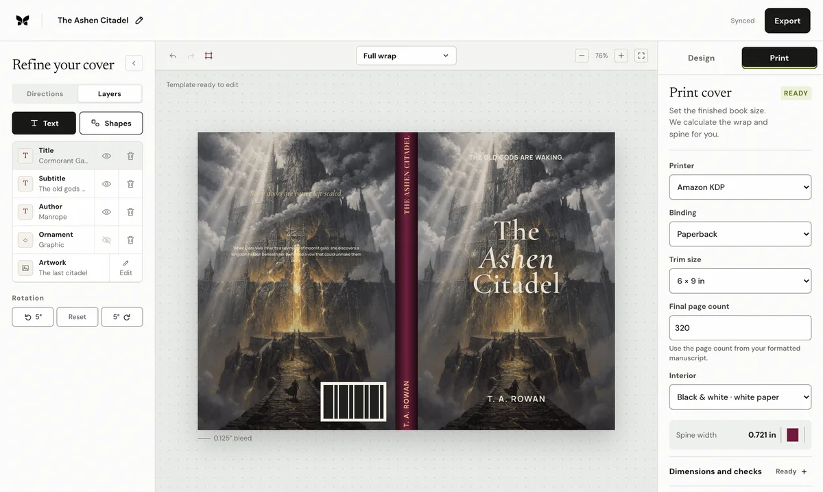
On a shelf, the spine is the only part of the book most browsers ever see. It is also the narrowest, most production-constrained surface on the wrap: its width is calculated from page count and paper, its folds move within manufacturing tolerance, and its text has platform rules about when it may exist at all.
Decide what earns a place on the spine
The title, the author surname, and a small publisher or series mark are the standard set. On a 0.6-inch spine there is no room for subtitles, taglines, or decorative flourishes that would crowd the lettering. If the series number matters to shelf buyers, give it a consistent position and treatment across every volume so a row of books reads as a set.
Let the binding set the constraints
Print-on-demand paperbacks are perfect bound: pages glued into a one-piece wrapped cover. The spine's width equals page count multiplied by the paper's per-page thickness, which is why the cover cannot be finalized before the interior is. Glue and crease tolerances mean the fold lines move slightly in production, so avoid hard color boundaries exactly on the folds and keep lettering clear of them.
Set the type for vertical reading
English-market spines conventionally run top-to-bottom, so the title reads correctly when the book lies face-up. Use the title's display face where width allows, or its supporting face when the spine is narrow. Keep clearance on both sides of the text, KDP asks for 0.0625 inches, and respect the thresholds: KDP allows spine text only above 79 pages, IngramSpark from 48.
Design the spine with the front, not after it
Carry the front's palette, type families, and one motif onto the spine so the book remains recognizable edge-on. Test the spine in context: render the wrap, crop the spine, and view it at shelf size beside other books. If the title disappears, increase weight and contrast before shrinking words, and confirm the final design on the printer's current template.
By Coverfairy Editorial · Published · Updated