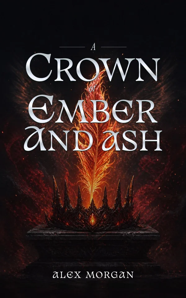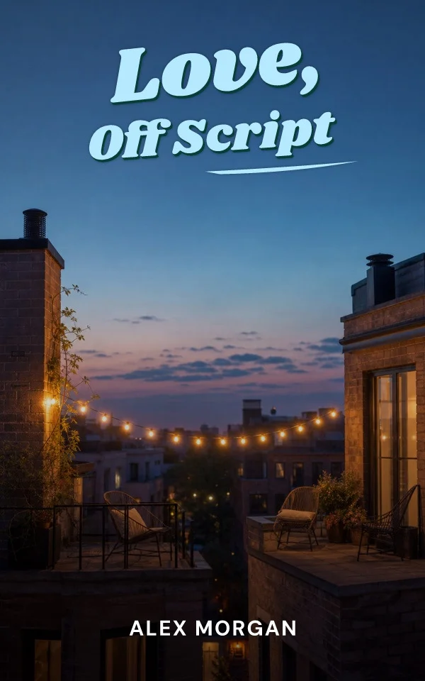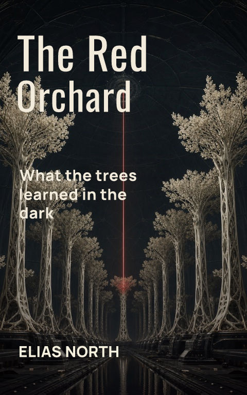
Dark romance covers carry an unusual responsibility: the genre spans a wide range of intensity, and the cover is the first content signal a reader receives. The visual conventions, black grounds, thorned botanicals, masks and blades, single luminous accents, exist because they communicate that register instantly. The craft is choosing which signals match this book.
Build around one charged symbol
The strongest dark romance covers isolate a single object with double meaning: a rose whose stem becomes a chain, a mask catching light, a ring on a blade's edge. One symbol against a disciplined dark field survives thumbnail reduction and gives a series its variation system. A montage of every motif reads as noise and signals nothing.
Let darkness stay legible
Near-black grounds compress the contrast available to the title, so the type must claim the brightest values on the cover. Bone, silver, or a single saturated accent for the title; supporting copy in a quieter register; no thin hairline strokes over texture. If the title needs a glow to survive, simplify the artwork behind it first.
Signal the spectrum honestly
Illustrated object covers read lighter; photographic shadow and skin read heavier; typography and accent color tune the promise between them. Match the signal to the manuscript. A cover styled like a lighter romantasy on a hard-edged book creates reviews about the mismatch rather than the story, and the algorithmic damage outlasts the launch.
Plan the series before book one
Dark romance readers binge series, and the shelf rewards a recognizable system: constant title architecture and ornament logic, one object and accent color rotating per book. Test the spines as a row, dark spines beside each other need distinct accents to separate, and keep the emblem visible at every size the storefront uses.
By Coverfairy Editorial · Published · Updated