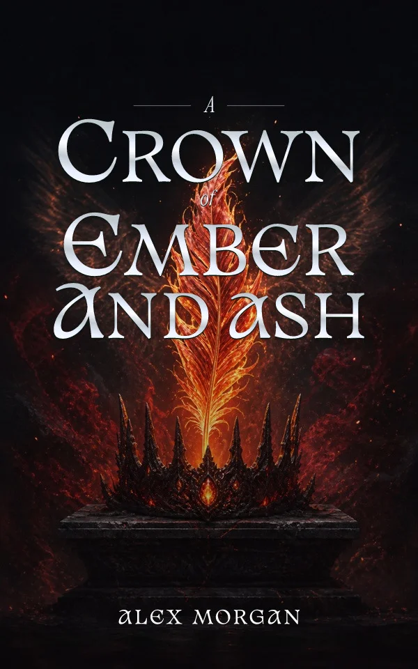
Romantasy became a shelf with its own visual grammar remarkably fast. Readers now parse the signals instantly: an ornate emblem promises court intrigue, entwined botanicals promise slow-burn tension, a blade wrapped in flowers promises danger with the romance. Designing inside that grammar without producing an interchangeable cover is the real brief.
The object emblem leads the category
The dominant romantasy system centers one symbolic object, a crown, dagger, rose, ring, mask, or paired creatures, rendered with metallic or luminous detail against a deep field. It survives thumbnails, adapts across a series by swapping the object, and avoids casting specific faces. If you use it, make the object story-specific: an heirloom with a broken setting says more than a generic crown.
Ornate serifs carry the tone
High-contrast serif titles with restrained swash details are the category's typographic signature. The risk is collision: swashes tangling with thorns, wings, and filigree until neither reads. Keep the title the brightest, clearest layer, give it a calm field inside the ornament, and test the silhouette at storefront size before approving any decorative detail.
Palette does the emotional work
Jewel tones on near-black grounds signal adult stakes; dawn golds and soft violets signal gentler romance; a single blood-red accent warns of darker content. Pick the palette from the book's actual temperature rather than the current bestseller, because a cover that promises spice the book does not deliver recruits the wrong reader, and reviews record the mismatch.
Series systems are the commercial engine
Romantasy sells in series, and the shelf rewards recognition: same title architecture, same ornament logic, new object and dominant color per volume. Define the invariant rules before designing book one. The wrap matters too, spines sit together on shelves and in hauls, so carry the emblem and palette onto the spine deliberately.
By Coverfairy Editorial · Published · Updated