Cinzel + Cormorant Garamond
Engraved capitals over a humanist serif for classic gothic weight.
Pairing 01 · title + author or subtitle

Preview engraved capitals, high-contrast serifs, and disciplined dark pairings for horror, dark fantasy, and gothic fiction.
Should a gothic book cover use blackletter?Rarely. Blackletter collapses at thumbnail size and reads as costume; engraved capitals or high-contrast serifs signal gothic more reliably.
Enter your title once to see how it looks in each font pairing.
Engraved capitals over a humanist serif for classic gothic weight.
Pairing 01 · title + author or subtitle
Razor contrast that feels dangerous without ornament.
Pairing 02 · title + author or subtitle
Traditional publishing gravitas with a clean modern floor.
Pairing 03 · title + author or subtitle
Candlelit elegance stabilized by a contemporary voice.
Pairing 04 · title + author or subtitle
Compressed dread balanced by a literary supporting face.
Pairing 05 · title + author or subtitle
Carved formality with a neutral information layer.
Pairing 06 · title + author or subtitle
Double-serif drama for ornate gothic romance.
Pairing 07 · title + author or subtitle
Blunt modern threat against an old-world accent.
Pairing 08 · title + author or subtitle
Test the actual title and author name together. Choose a style that fits your genre and stays readable when the cover is small.
Gothic typography earns its atmosphere through structure, not decoration. Engraved capitals, high stroke contrast, and generous tracking suggest age, ritual, and dread while remaining printable and legible. Blackletter and heavily distressed display faces read as costume at thumbnail size and usually collapse into texture; if the story needs that register, reserve it for one short word and support it with a disciplined serif system.
Dark covers compress the value range the title can use. Against near-black grounds, thin gothic strokes disappear first, so test the real title over the actual artwork rather than a neutral specimen. Weight, size, and letter spacing are safer sources of drama than delicate hairlines. A pale title field, moonlit accent, or carved-stone treatment can restore contrast without brightening the whole composition.
Gothic fiction spans romance, horror, mystery, and literary work, and the type should follow the subgenre's temperature. A gothic romance can afford lyrical italics and ornamental contrast; a haunted-house novel may need colder, more architectural capitals; literary gothic often benefits from restraint that lets the imagery unsettle. Choose the pairing that matches the reading experience, then verify every glyph the actual title needs.
Compare two or three choices on the complete cover before deciding. Check every word, including the author name and any subtitle. Finish by shrinking the complete cover to roughly the size it will occupy in a search result. Remove effects one at a time and confirm that the hierarchy still works in plain type. Shadows, outlines, texture, and metallic treatments should strengthen an already legible composition; they should never be the only reason a word can be read.
Pair high-contrast serifs with one restrained ornamental accent.
Use carved capitals and let stone, shadow, or doorway imagery breathe.
Choose quiet, structural type and let the artwork carry the unease.
Bone, parchment, silver, and single jewel accents hold contrast against dark grounds better than saturated brights.
Yes. The horror and dark-fantasy pages share several families; choose by the story's temperature rather than the label.
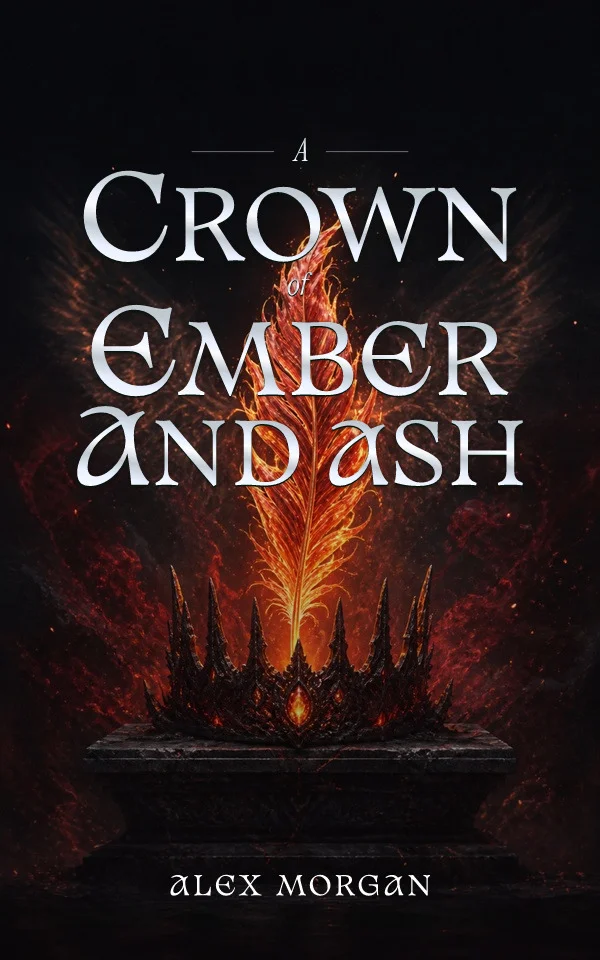
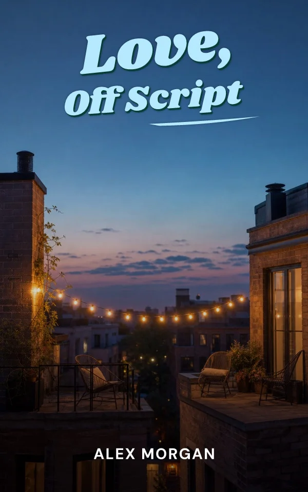
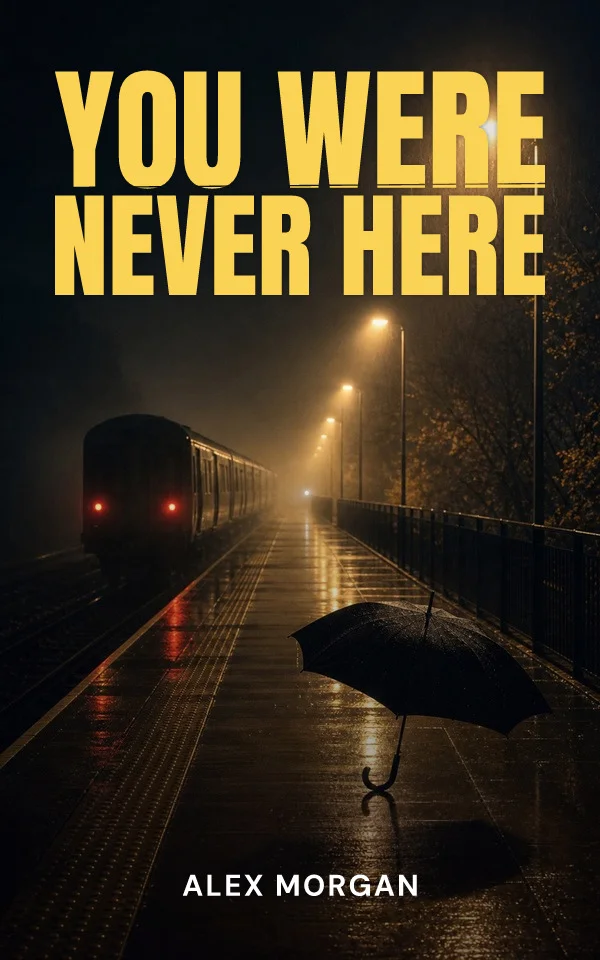
Start from your story, then try editable typography and artwork. Examples made with the Coverfairy editor: