Bodoni Moda + Manrope
Editorial elegance for sweeping or glamorous romance.
Pairing 01 · title + author or subtitle

Preview editorial serif, contemporary sans, historical high contrast, and carefully limited script accents.
Does a romance cover need a script font?No. Intimacy can come from italics, scale, spacing, color, illustration, and composition without script.
Enter your title once to see how it looks in each font pairing.
Editorial elegance for sweeping or glamorous romance.
Pairing 01 · title + author or subtitle
Warm contemporary personality with excellent supporting text.
Pairing 02 · title + author or subtitle
Emotional scale balanced by a clean modern voice.
Pairing 03 · title + author or subtitle
Bold romantic comedy energy with a softer secondary face.
Pairing 04 · title + author or subtitle
High contrast for historical, luxury, or dramatic stories.
Pairing 05 · title + author or subtitle
Intimate italics with a steady series system.
Pairing 06 · title + author or subtitle
Direct contemporary type with an elegant accent.
Pairing 07 · title + author or subtitle
Friendly curves for illustration-led contemporary romance.
Pairing 08 · title + author or subtitle
Test the actual title and author name together. Choose a style that fits your genre and stays readable when the cover is small.
Romance typography communicates emotional temperature before it communicates period or setting. High-contrast serifs can feel sweeping, glamorous, or historical; rounder contemporary faces can promise warmth and humor; bold condensed type can signal high energy. Choose the relationship experience first, then decide whether the title should whisper, flirt, ache, or announce itself.
Script is an accent, not a requirement. Fine connecting strokes often disappear over faces, rain, hair, flowers, or painterly texture. If script adds something essential, reserve it for one short word and pair it with a strong readable family. Italic serif, unusual scale, and expressive line breaks can create intimacy without relying on a familiar handwritten cliché.
A romance series needs recognizable author scale and title placement while the couple, location, color, or illustrative scenario changes. Test the longest planned title, because a system built around two short words may collapse on book three. Check thumbnail legibility beside real category covers and keep hooks or tropes clearly subordinate to the main title.
Compare two or three choices on the complete cover before deciding. Check every word, including the author name and any subtitle. Finish by shrinking the complete cover to roughly the size it will occupy in a search result. Remove effects one at a time and confirm that the hierarchy still works in plain type. Shadows, outlines, texture, and metallic treatments should strengthen an already legible composition; they should never be the only reason a word can be read.
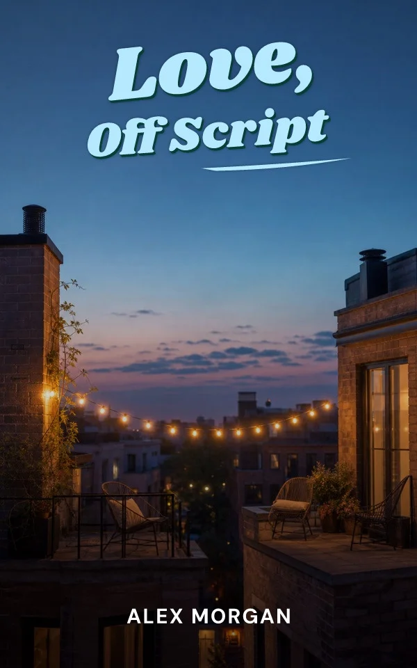
Use warm curves, clear lowercase, and a compact supporting sans.
Let high contrast and generous scale carry elegance without thin decorative clutter.
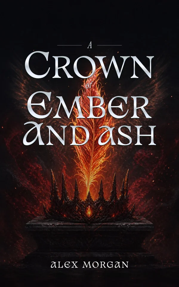
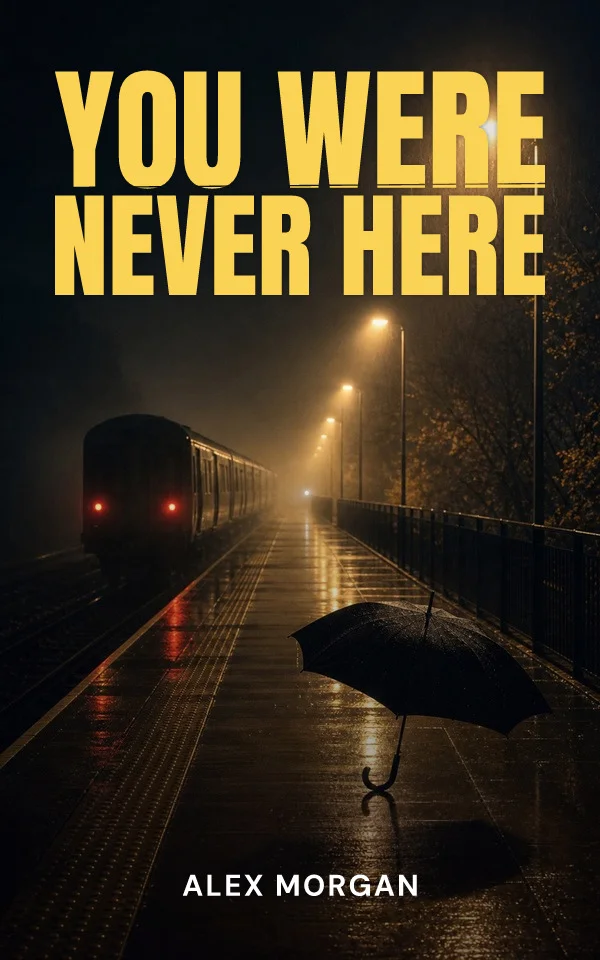
Combine emotional serif detail with the weight and contrast expected from danger.
Use it sparingly, enlarge it, preserve clear space behind it, and test every stroke at retailer-thumbnail size.
Usually yes. Repeat the title and author system while changing artwork, color, or a story-specific accent.
Start from your story, then try editable typography and artwork. Examples made with the Coverfairy editor: