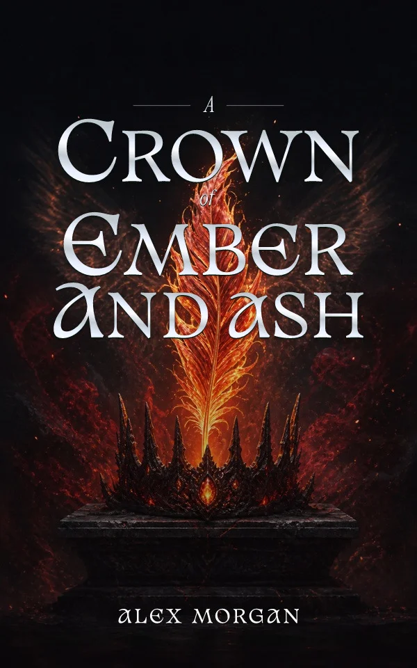
An audiobook cover should belong to the same book without pretending that a portrait and a square are interchangeable. Preserve the identity readers recognize, then rebuild the artwork crop and type hierarchy for the 1:1 storefront tile and the platform's current delivery rules.
Decide what recognition must survive
Identify the few elements that make the approved ebook recognizable: title treatment, author name, dominant color relationship, central subject, motif, or series mark. Protect those signals before moving anything. Small ornaments and secondary copy may disappear in the square, but the emotional promise and visual identity should not become a different book.
Rebuild the composition on a true square
Return to the editable background and type rather than cropping a flattened ebook front. Extend, reposition, or replace artwork so the focal subject has room in 1:1. Avoid adding side borders merely to preserve the portrait rectangle. If the source image cannot support the new crop, choose a related asset or regenerate the visual direction with square composition and clear type space in the brief.
Simplify the audiobook hierarchy
Audiobook tiles can appear small, so preserve the exact credited title and author while reconsidering line breaks, scale, and supporting copy. A long subtitle or review quote that works on a print cover may compete with the essential metadata. Keep lettering as editable type, inspect it after compression, and leave flexible space where a platform may apply its own label.
Preflight audio as its own deliverable
Check the square dimensions, source resolution, visible title and author, RGB output, supported file type, and current file-size limit against the platform's live documentation. Remove print-only elements such as a barcode, price, or physical-media reference. Compare the ebook and audiobook at thumbnail size, then archive both approved files as coordinated outputs from the same cover project.
Map portrait elements to square roles
List every element on the portrait front and assign one of four square roles: preserve, resize, move, or remove. The title and author normally survive; the focal subject may move; a series line may shrink; a review quote may disappear. Build the square from those decisions instead of letting a center crop decide for you. If the portrait relies on vertical distance, replace that distance with scale, overlap, or a stronger foreground-to-background relationship.
Approve the square at three viewing sizes
Inspect the file at full resolution for artifacts and edge quality, at a medium store-card size for hierarchy, and at a small phone tile for recognition. Compare it beside the ebook rather than in isolation. The pair should clearly belong to one release while each composition fills its own shape. Recheck the final compressed file, because fine title strokes and subtle tonal separation can fail after export even when the editable canvas looked clean.
Sources and verification
Requirements can change. Check the linked instructions before you publish or upload a file.
By Coverfairy Editorial · Published · Updated