Romance book cover ideas need to signal more than the presence of a couple. Character distance, gaze, setting, illustration style, typography, and color help readers predict whether the book is comic, tender, dangerous, historical, paranormal, or highly sensual.
What should a romance cover communicate first?
Identify the subgenre, emotional temperature, and central relationship dynamic. A bright illustrated romantic comedy, a shadowed romantic suspense cover, and an ornate historical romance may all feature two people but promise different experiences. Write that promise in one sentence before choosing poses, clothing, symbols, or type.
Do the characters need to appear?
No. Character-led covers can communicate chemistry quickly, while symbolic objects, settings, florals, architecture, or typographic systems can create intrigue and leave appearance to the reader. The choice should reflect the audience and story. If characters appear, their age, styling, body language, and environment must not contradict the manuscript.
How does typography change the romance signal?
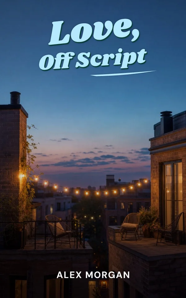
Soft scripts, expressive serifs, bold illustrated lettering, and compressed capitals carry different tones. Use a display face for the title's emotional role and a quieter supporting face for author, subtitle, or series information. Keep script lettering large enough to survive a thumbnail and avoid making every line decorative. The title should remain a readable shape before its flourishes are inspected.
How do you make a romance series recognizable?
Repeat a title architecture, author treatment, crop rule, motif, or palette relationship rather than duplicating one scene. Give each volume its own character pairing, object, season, or dominant color. Test the books together at thumbnail size and calculate every print spine separately so the visual family survives different page counts.
Match the illustration style to the heat level
Within illustrated romance, style choices carry meaning readers parse instantly: flat, bright character art signals wit and lower heat; painterly or high-detail illustration can carry drama, fantasy crossover, or higher sensuality; hand-lettered titles add warmth and humor. Misalignment between style and content is the most common reason an otherwise attractive romance cover recruits readers the book disappoints, and reviews record the mismatch.
Use tropes as signals, not slogans
Enemies-to-lovers, second chance, forced proximity, and small-town settings all have visual shorthand: distance and posture between characters, a shared object, a recognizable setting. Signaling the trope visually is stronger than printing it. If trope text belongs on the cover at all, keep it subordinate to the title and test that it survives thumbnail reduction without fragmenting the hierarchy.
Contemporary and rom-com: bright, witty, illustrated
Flat, saturated illustration with hand-drawn energy currently owns the lighter contemporary shelf. The idea to borrow is the register: playful body language, an object or setting that stages the meet, and type with personality doing part of the joke. Keep the promise honest, an illustrated cover on a high-heat book recruits readers the content will surprise, in both directions.
Historical, dark, and paranormal: signal the stakes
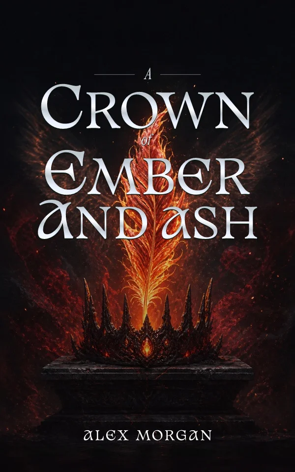
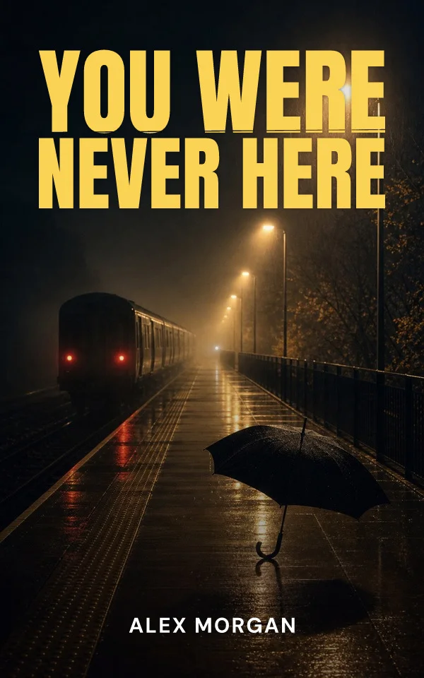
Ornate serifs, jewel tones, and photographic or painterly treatments tell readers the story carries danger, history, or obsession. Architecture, costume detail, and shadow do the world-building; the couple can recede or vanish entirely. The discipline is restraint: one era signal, one threat signal, and a title treatment that stays readable under the atmosphere.
Romantasy: promise both worlds
Romantasy covers must signal fantasy scale and romantic stakes in one image, which is why symbol-led designs, crowns, blades, botanicals, celestial motifs, wrapped in charged palettes dominate the category. The pairing of an ornamental object with intimate typography lets readers see both promises at thumbnail size without a literal couple.
By Coverfairy Editorial · Published · Updated