



What do romance readers expect from a cover?
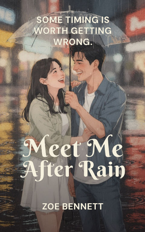
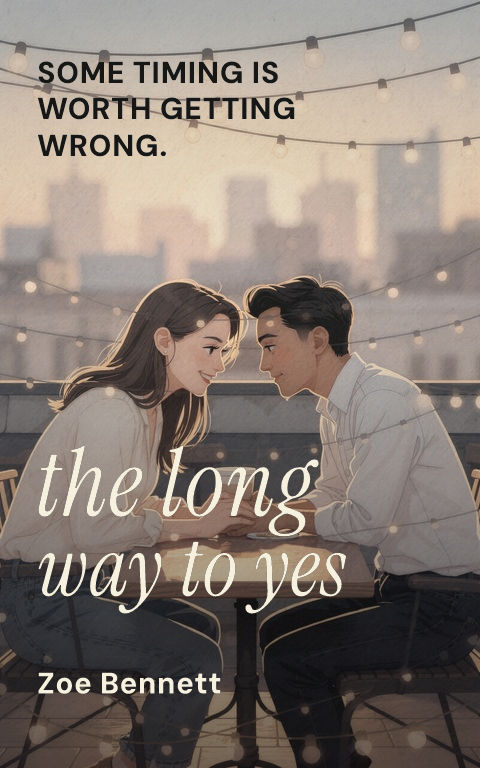
An accurate heat and tone signal. Illustrated covers currently signal contemporary, witty, or lighter stories; photographic couples signal higher heat or drama; scenic and typographic covers suit literary or emotionally weighted narratives. A cover that misleads recruits the wrong readers and costs reviews, so match the visual register to what the book delivers.
Should a romance cover be illustrated or photographic?
Choose by subgenre convention and by what can be executed well. Illustration gives control over body language, diversity, and setting without stock-photo limits, while photography brings immediacy and suits romantic suspense or small-town contemporary. Study the current top covers in the exact subcategory rather than romance as one undifferentiated shelf.
How does a romance cover stand out without breaking genre?
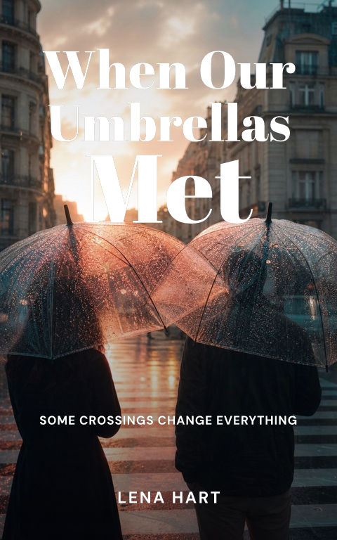
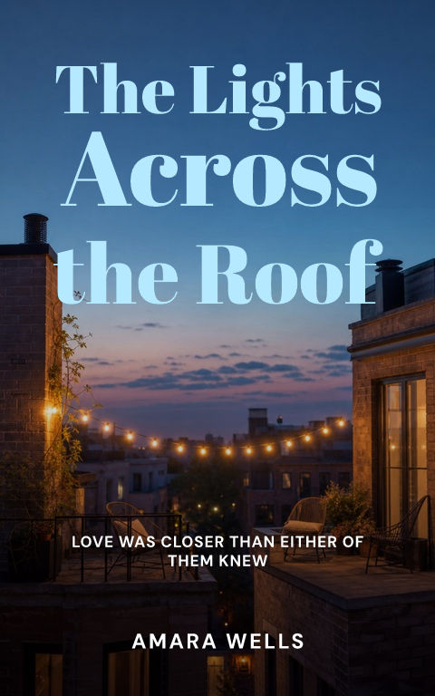
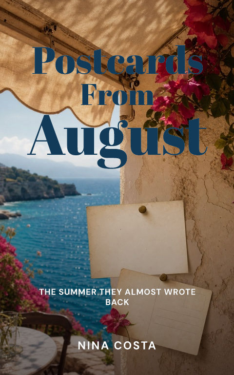
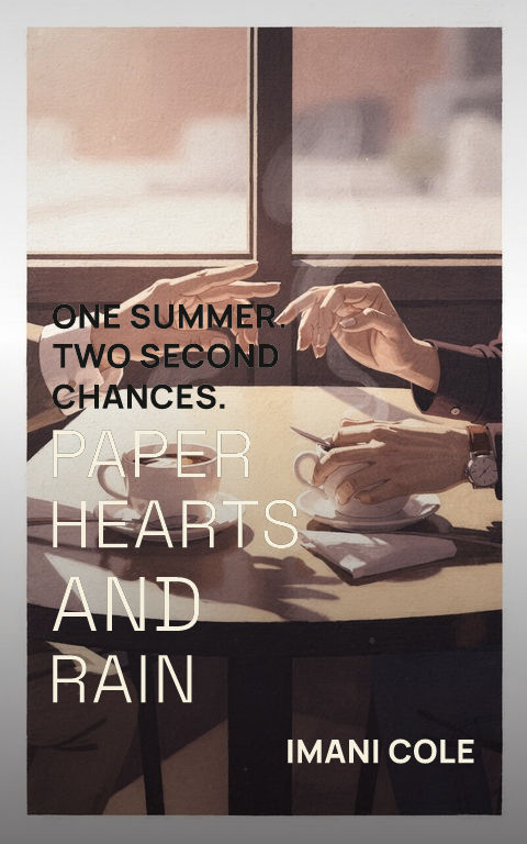
Vary one register while keeping the others familiar: an unexpected palette on a conventional composition, a distinctive object standing in for the couple, or expressive type over a quiet scene. Readers must recognize the category instantly. One controlled deviation creates memorability; several at once read as the wrong genre.
Turn inspiration into a distinct cover
Compare the structural choice behind each example: one symbol, one world, one person, a cinematic crop, a graphic field, illustration, abstraction, or storybook detail. Select the structure that carries the manuscript's clearest promise.
Study the composition, title hierarchy, crop, contrast, and repeated motif, not the surface details. Change the subject, palette, type family, and visual rhythm until the result belongs to the new story.
Start with a blank cover