

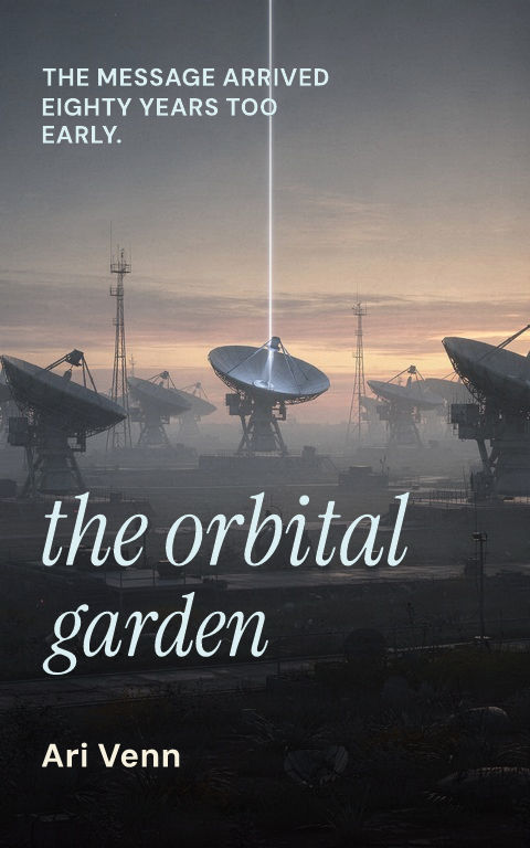






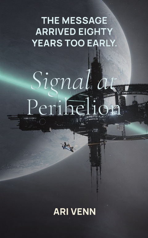
What defines the vintage sci-fi cover look?
Systems rather than nostalgia: limited ink-like palettes, hard geometry, halftone and grain texture, impossible scale, and an assertive typographic block. Those constraints came from mid-century printing budgets, which is why the style still reads as disciplined rather than decorative when it is rebuilt with modern production quality.
How do you use the vintage style without imitating a real cover?
Borrow the grammar and change every word. Keep a restricted palette but choose different hues; keep the geometric composition but build it from this story's object or setting; keep the bold type block but set the actual title in a properly licensed face. Recreating a recognizable historic cover invites rights problems and reads as pastiche.
Does a retro cover fit a modern sci-fi story?
It fits idea-driven fiction: first contact, strange physics, and social speculation all benefit from the style's conceptual confidence. Fast-paced military or romance-led science fiction usually needs more contemporary signals. Decide whether the book's core promise is the idea or the momentum, then choose the register accordingly.
Turn inspiration into a distinct cover
For vintage science fiction, borrow systems rather than surfaces: limited palettes, assertive geometry, halftone rhythm, impossible scale, and one strong typographic block. Change the subject and visual logic instead of reproducing a historic cover.
Study the composition, title hierarchy, crop, contrast, and repeated motif, not the surface details. Change the subject, palette, type family, and visual rhythm until the result belongs to the new story.
Start with a blank cover