

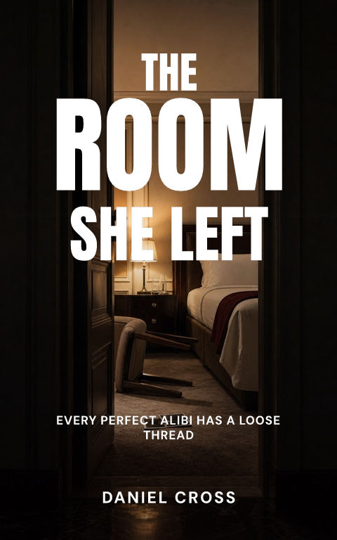
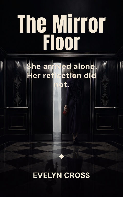
How does a mystery cover differ from a thriller cover?
A mystery invites the reader to solve; a thriller warns them to survive. Mystery covers can therefore afford curiosity, wit, and setting detail — the clue object, the closed room, the village map — where thrillers compress toward threat. Cozy mysteries go further into illustration and warmth, while procedurals sit closer to thriller darkness.
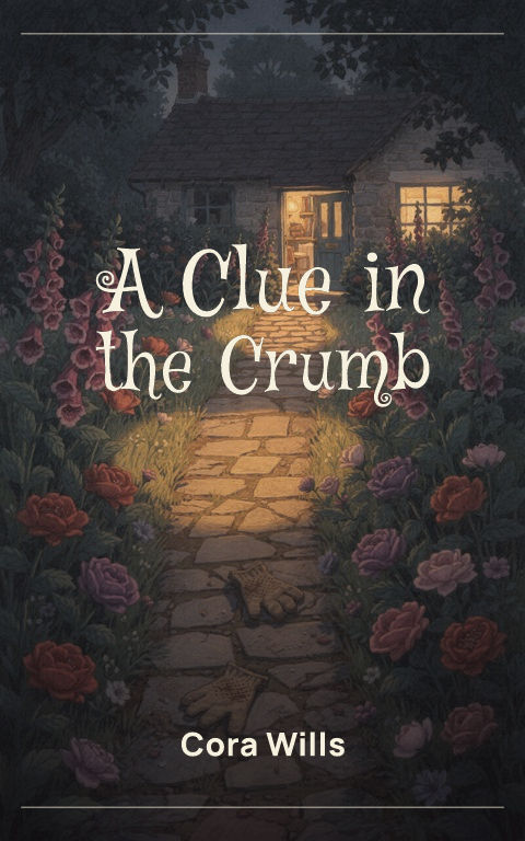
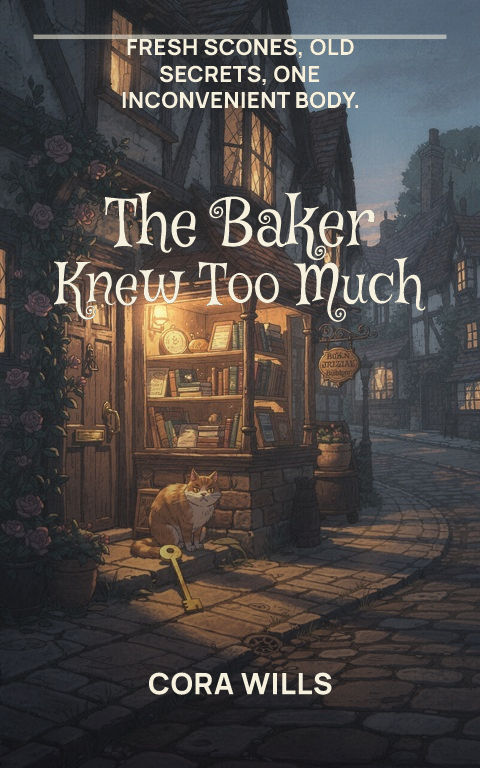
What belongs on a cozy mystery cover?
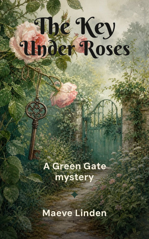
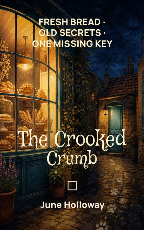
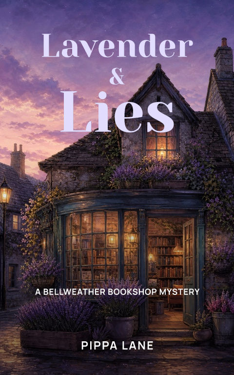
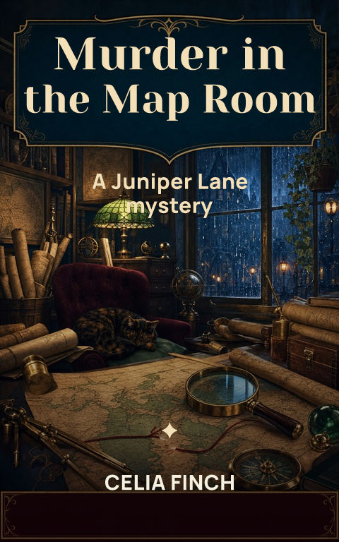
An inviting illustrated scene with one wrong detail. The bakery, bookshop, garden, or seaside village establishes charm, while a tipped-over teacup, a shadow, or a single out-of-place clue signals the crime without gore. Series-ready typography matters more here than in most categories because cozy readers buy by series identity.
How do you signal a historical or literary mystery?
Period texture and restraint. Archival imagery, engraved-feeling type, muted palettes, and documentary framing signal a historical setting; generous space, serif typography, and one symbolic object signal literary intent. Both depend on precision — a wrong-period typeface quietly undermines the promise the rest of the cover makes.
Turn inspiration into a distinct cover
Compare the structural choice behind each example: one symbol, one world, one person, a cinematic crop, a graphic field, illustration, abstraction, or storybook detail. Select the structure that carries the manuscript's clearest promise.
Study the composition, title hierarchy, crop, contrast, and repeated motif, not the surface details. Change the subject, palette, type family, and visual rhythm until the result belongs to the new story.
Start with a blank cover