No genre's packaging has swung harder than romance. In fifty years the category moved from painted embraces to model-fronted mass market, to quiet objects on black, to the bright illustrated covers dominating today's shelves. The swings were never random: each era solved a signaling problem created by the one before it.
The painted clinch built the category
From the 1970s, mass-market historical romance was sold by painted covers of couples in dramatic embrace, the clinch. The style was expensive, artist-driven, and unmistakable at drugstore-rack distance: readers could identify the category, the heat, and the subgenre from meters away. Its weakness was sameness; when every cover promises passion at the same volume, individual books struggle to be remembered.
The model era made faces the brand
By the late 1980s publishers moved from anonymous painted couples toward recognizable cover models, and Fabio Lanzoni reportedly fronted hundreds of covers, becoming more famous than most of the books. The era proved something durable: a repeated, recognizable element builds category trust fast, and also demonstrated the cost, when the shorthand became a punchline, the whole category carried the joke.
Minimalism borrowed prestige
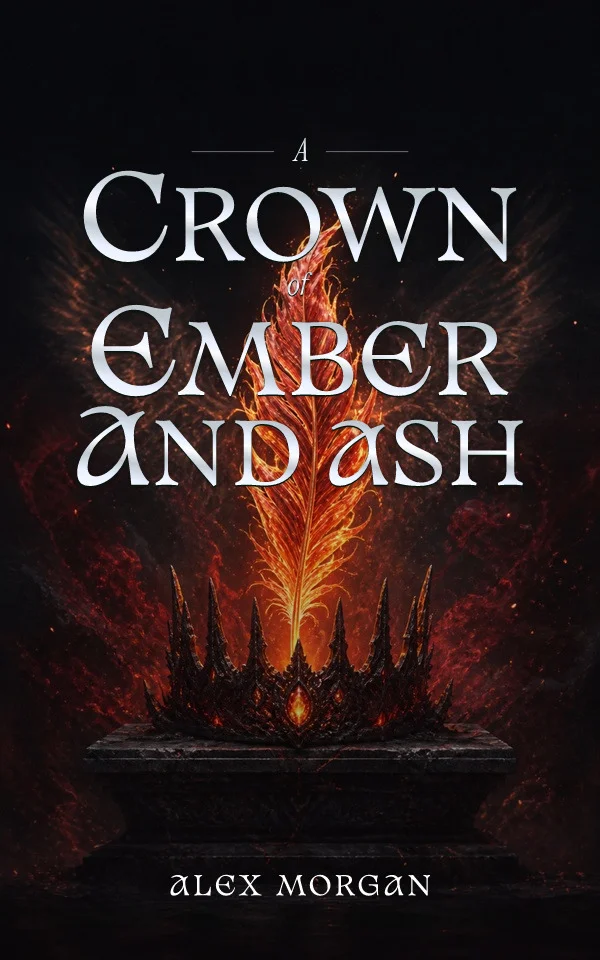
Through the 2000s much of the category quieted: photographic covers, single symbolic objects, restrained type, a shift accelerated by paranormal romance's dark, object-led packaging. Minimal covers photographed well in early online stores and let steamy content sit discreetly on commuter trains. The trade was legibility: without the clinch, subgenre and heat level became harder to read from the cover alone.
Illustration took over the storefront
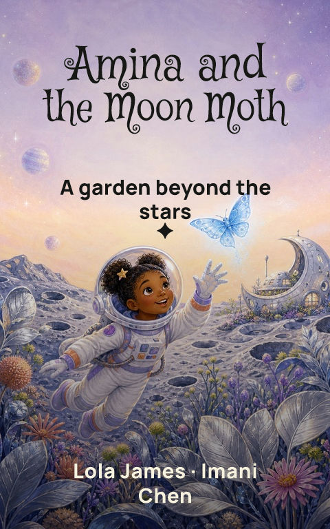
Since the late 2010s, flat, bright, character-led illustration has dominated contemporary romance. The style is thumbnail-native: bold color fields and simple shapes survive a phone grid where painted detail turns to mud. It also broadened who appears on covers and softened explicitness into wit. The current tension is the one every era ends with, as the style saturates, illustrated covers increasingly signal only that the book is recent, and the cycle will turn again.
What the history teaches a cover buyer
Every era was a signaling system, and readers always learned it fast. The practical lesson is not to imitate the current wave by default but to place your book precisely inside it: match the current grammar of your exact subgenre and heat level, then differentiate with one specific, ownable element. And because eras turn, keep the cover editable, the authors who re-covered quickly when styles shifted kept their backlists selling.
By Coverfairy Editorial · Published · Updated