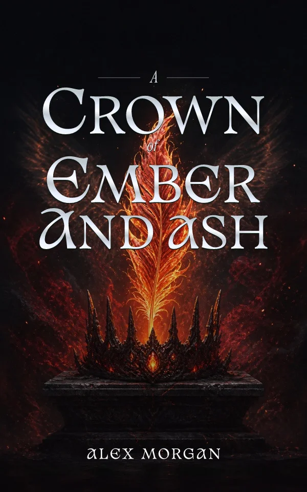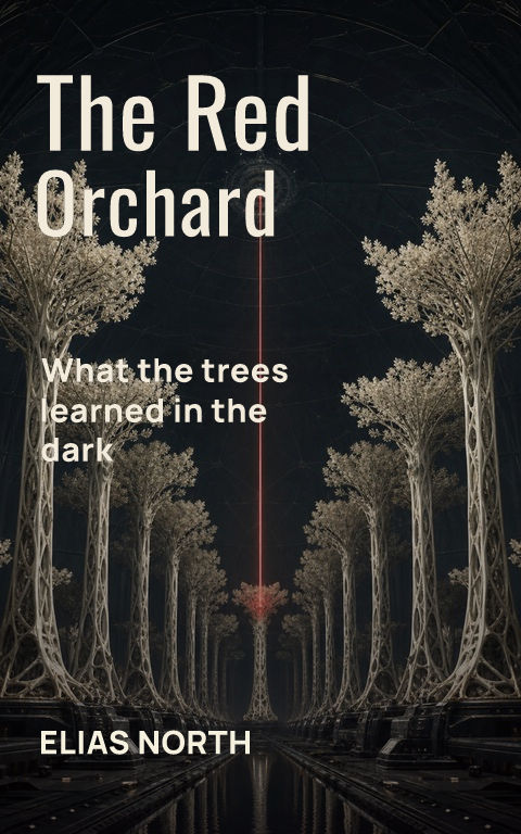
Minimalist covers look effortless, which is exactly why they are hard. With three elements on the page, every proportion, margin, and letterform is exposed. There is no texture to hide a weak title setting and no busy artwork to disguise an undecided concept. Before choosing the style, it helps to understand what the restraint is actually doing.
Minimalism is a decision, not an absence
A strong minimal cover starts from one decisive idea: a paperclip standing in for a stolen identity, a single torn edge, a title broken across the page in a way that enacts the book's tension. The elements are few because the idea is sharp enough to survive alone. If the concept cannot be stated in one sentence, removing elements will only make the cover emptier, not stronger.
Where restraint matches the shelf
Literary fiction, essays, big-idea nonfiction, poetry, and memoir accept, and often reward, understated covers, because their readers browse shelves where restraint signals seriousness. Commercial romance, epic fantasy, and most children's categories generally do not: their readers scan for character, world, and emotional temperature, and a stark cover reads as the wrong promise rather than a confident one. Check the current bestsellers in the exact category before committing.
Typography carries most of the weight
When imagery recedes, the title setting becomes the artwork. Letter spacing, line breaks, weight contrast, and placement need the same attention an illustrator would give a focal figure. Test the title as a shape at thumbnail size, try versions with and without a supporting serif or sans, and be suspicious of decorative faces — minimal covers usually need fewer, better fonts, not more expressive ones.
Color and space are active ingredients
A minimal cover's background is not leftover space; it is the dominant visual mass. A saturated field can make one small object feel charged, while generous off-white space can make the same object feel forensic. Choose the background as deliberately as the focal element, and confirm the cover still separates from a white storefront page — very light minimal covers can dissolve into the page behind them.
Use a three-pass test before calling it finished
First remove the title and ask whether the remaining symbol or field still communicates a specific tension rather than a generic mood. Then restore only the title and ask whether its line breaks, scale, spacing, and position feel intentional without the image. Finally judge the complete cover at full size, retailer-thumbnail size, and beside six current books for the same reader. A design that works only while enlarged is an illustration, not yet a selling cover; one that works alone but disappears beside its shelf may need stronger color, scale, or category signals. Keep a rejected busier version during the test so restraint is a decision you can compare, not an aesthetic assumption.
By Coverfairy Editorial · Published · Updated