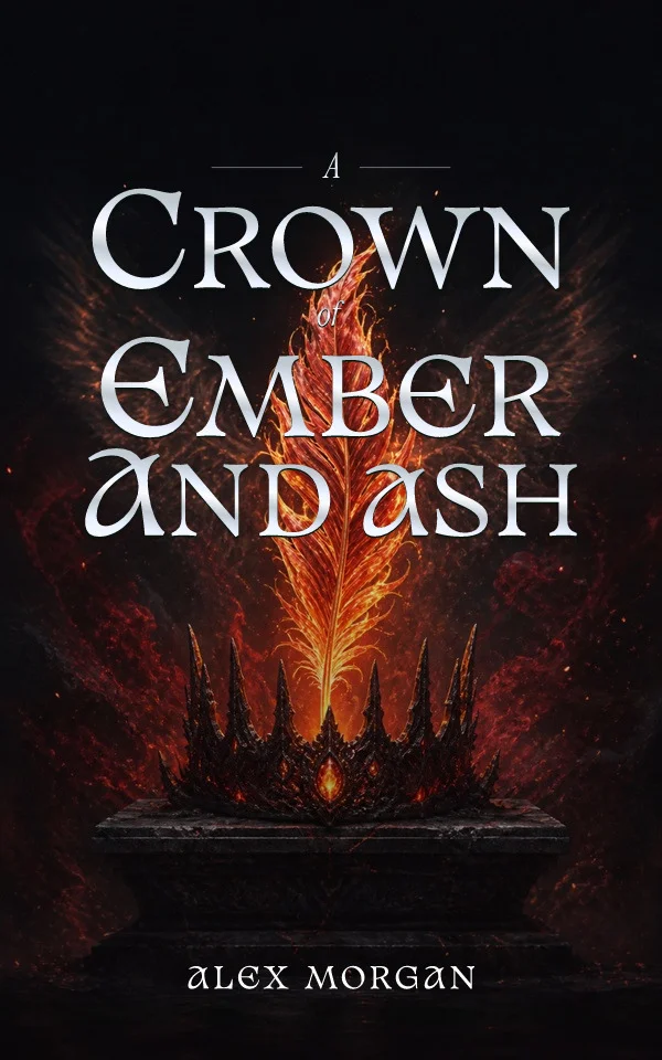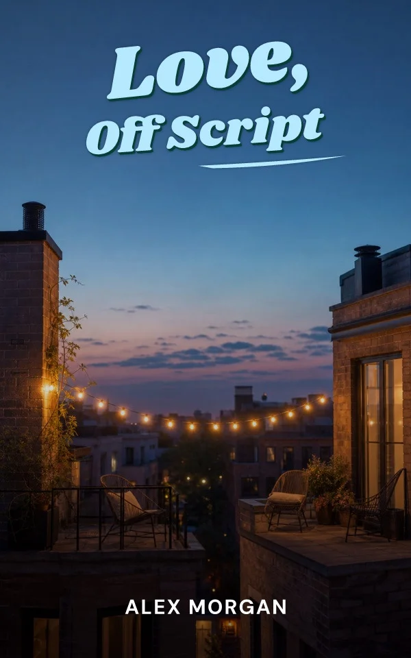
Every list of iconic covers repeats the same names, and it is tempting to treat them as relics of bigger budgets. But the reasons they worked are unusually practical. Strip away the fame and each one demonstrates a decision a self-publishing author can make today, on an ordinary budget, with the tools already on this site.
One image, total commitment
Francis Cugat's painting for The Great Gatsby — the disembodied eyes over carnival light — was famously finished before the novel itself, and it works because nothing on the jacket competes with it. The same is true of the shark rising on the Jaws paperback and the skeletal T. rex Chip Kidd drew for Jurassic Park. None of these covers hedge with secondary images. The transferable lesson: choose one idea and give it the entire canvas, rather than negotiating between three half-ideas.
Typography can be the whole concept
A large share of iconic covers contain no illustration at all. Bold type at unapologetic scale, a title broken meaningfully across lines, or lettering that enacts the book's premise can carry everything. This is also the most budget-transferable approach: strong typesetting costs judgment, not licensing. If the title is distinctive, test a purely typographic direction before assuming the cover needs artwork.
Systems become identity
Penguin's grid-based paperback covers are recognizable across thousands of titles because the system — band placement, type discipline, restrained color coding — repeats while the content changes. That is precisely the logic of a series cover system: fix the architecture, vary one element per book. A self-published series earns the same recognition by repeating title placement, author scale, and type family while the artwork or palette rotates.
Icons were designed for their context
Each famous cover was built for the display context of its era — bookshop tables, drugstore spinner racks, subway posters. Their designers optimized ruthlessly for how the book would actually be encountered. Today that context is a thumbnail in a scrolling grid, which is why every principle above should be verified at small size first. The homage worth paying to the classics is contextual discipline, not visual imitation — copying a famous composition risks both legal trouble and a cover that solves the wrong decade's problem.
By Coverfairy Editorial · Published · Updated