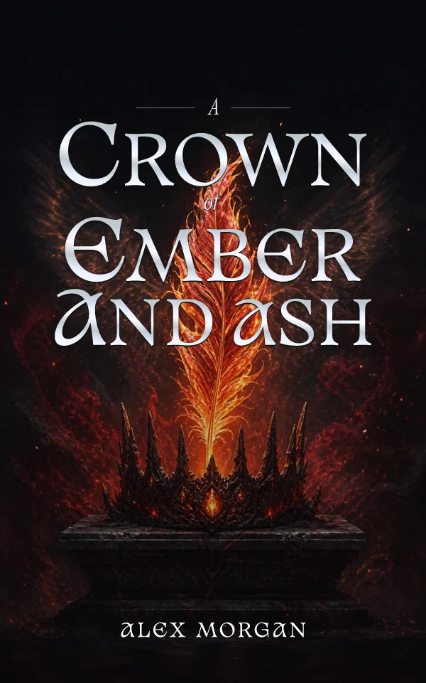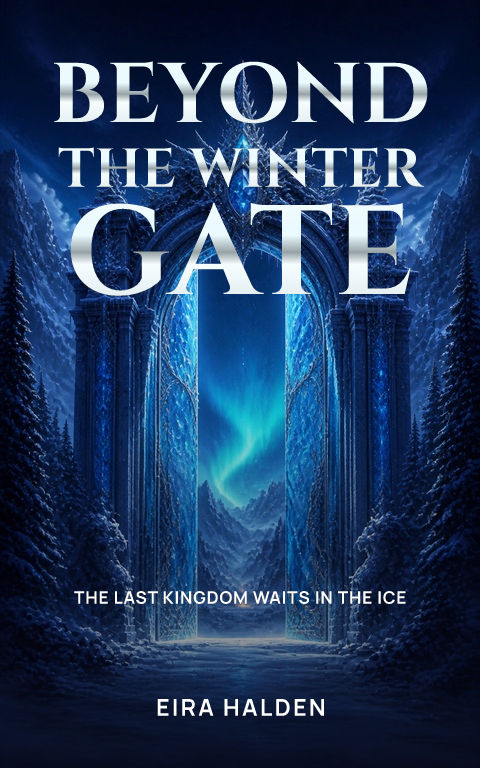
A font gives the same title a different feeling. It can suggest a dangerous fantasy, a tender romance or a direct, practical guide before the reader sees the description. The useful question is whether the font suits your book and still makes its words easy to read. Here is a simple way to choose without getting lost in hundreds of options.
Preview your complete title first
Put the real title into the font preview before comparing styles. Long titles need enough room for several clean lines; a short title can support larger or more decorative letters. In the Coverfairy editor, preview the font choices before applying one. Check repeated letters, punctuation and the longest word. If the title only fits after shrinking it until it is hard to read, try a narrower font or a different text layout.
Choose the feeling your reader expects
Use recent covers in your own genre as a reference for the overall feeling, then build your own design. A fantasy can use dramatic or ornate letters; a thriller can use a tall, bold title; a romance can feel soft or lively; nonfiction often benefits from a direct, confident title. These are starting points, not rules. The artwork and text need to agree about what kind of book this is.
Give the title, subtitle and author different jobs
The title attracts attention. The subtitle explains something the title cannot, especially for nonfiction. The author identifies who wrote the book. You can use an expressive font for the title and a simpler one for the smaller words. Avoid making all three compete at the same size. If the subtitle is long, edit it or give it a separate area instead of forcing every line into the title space.
Try colour and shadow after the font works
Start with text that you can read without effects. Then test a lighter or darker colour against the artwork. A small shadow can separate pale letters from a mixed background; a stronger outline can help a playful title. Too much shadow can muddy small letters. Move the text into a clearer part of the image before piling on effects. A metallic or decorative finish should add character while leaving the title legible.
Keep the words editable
Keep the title and author as text rather than asking an image generator to paint them into the artwork. That lets you fix a spelling, change a subtitle or choose another font without replacing the whole image. Coverfairy's artwork and text are separate. You can try a sample, change its font, and compare the complete cover before paying for publishing downloads. Check the character support and licence of any font you bring into a separate design tool.
Sources and verification
Requirements can change. Check the linked instructions before you publish or upload a file.
By Coverfairy Editorial · Published · Updated