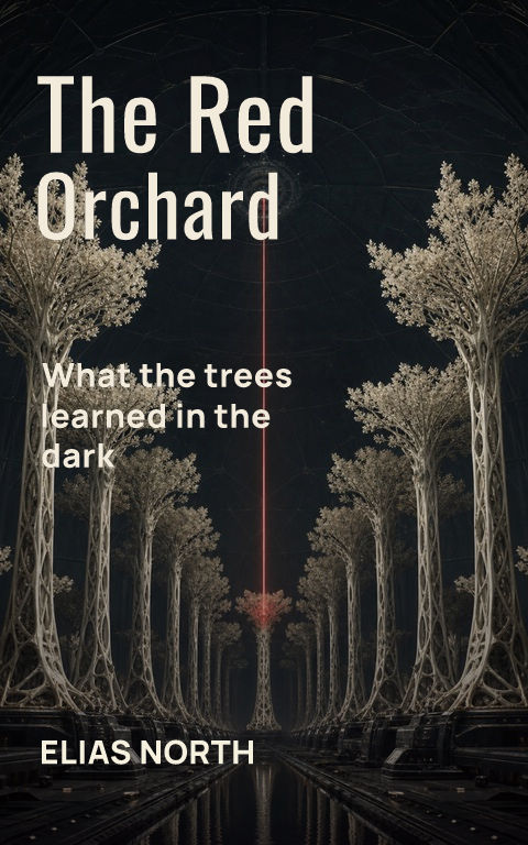
A nonfiction title can make the big idea memorable while the subtitle explains the audience, method, scope, or result. The two lines have different jobs. Design them as one promise, then let scale, width, spacing, and position establish the reading order without shrinking the explanation into decorative fine print.
Edit the promise before styling it
Read the title and subtitle as one sentence of positioning. Remove repeated words, unsupported outcomes, crowded lists, and category labels the cover already communicates. A conceptual title usually needs a clearer subtitle; a specific practical title may need less explanation. Verify claims, credentials, edition wording, and foreword credits before using typography to make them more authoritative.
Give title and subtitle different visual jobs
Let the title create the dominant silhouette through size, weight, or width. Set the subtitle in a calmer supporting face or treatment with enough contrast and line spacing for comfortable reading on the full cover. The smallest thumbnail may not preserve every subtitle word. At full size, the line should remain visibly structured rather than dissolving into a gray block.
Control line breaks by meaning
Break the subtitle at grammatical units and keep related phrases together. Compare a narrower multi-line measure with one long line that forces tiny type. Avoid centered lines that create accidental shapes or leave a single short word stranded. Test the actual title, subtitle, author name, and credentials together because sample copy hides the real pressure on the layout.
Test every place the hierarchy must work
Shrink the front beside current books for the same reader, inspect the ebook at production size, and print the paperback front at actual dimensions. Check whether artwork competes behind the subtitle and whether the author line remains distinct. For a series, define which role repeats and how longer subtitles can reflow without moving every other element.
Build three hierarchy variants before choosing fonts
Set one version with a dominant title and compact subtitle block, one with a quieter conceptual title and more explicit subtitle, and one that uses width or alignment rather than a second typeface to separate the roles. Use plain dependable fonts during this test. The purpose is to choose the reading order and line structure before decorative character makes one version feel prematurely finished.
Carry the promise onto the spine and back
The front subtitle may shorten or disappear at thumbnail size, but the complete wrap can reinforce the proposition through the spine, back-cover heading, blurb, credentials, and proof points. Keep those roles coordinated without repeating the same claim four times. Recheck the hierarchy after the final page count changes the spine, because a narrower or wider spine can alter the title system across the object.
By Coverfairy Editorial · Published · Updated