

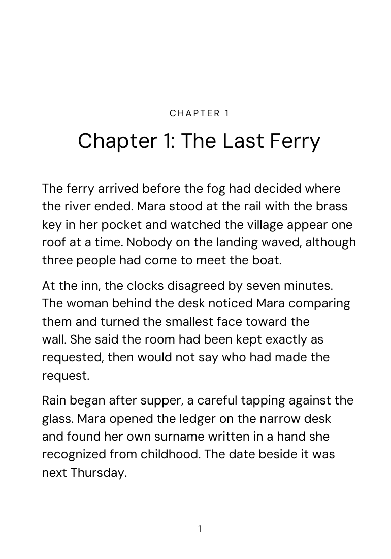
Define the edition before choosing a point size
Large print is a reader-facing promise, so state what the edition changes and use the description consistently in metadata, the copyright page, and sales copy. The Library of Congress notes that large-print materials are commonly set at 16 to 18 points and that 14 points is a minimum in a US postal standard, but point size alone does not guarantee readable results.
Typeface x-height, stroke weight, contrast, line spacing, line length, paper, and the reader's needs change how large the text feels. Test actual paragraphs, italics, bold, numerals, punctuation, and the longest headings. Avoid treating a single number as an accessibility certification.
Choose a trim that supports the larger text
Increasing type on the original compact trim can produce very short lines, excessive hyphenation, loose spacing, and constant page turns. A larger trim such as 7 x 10 inches can create a more useful measure while keeping the book physically manageable, but category, printer support, page limits, and cost still matter.
Set new mirrored margins and gutter for the new trim and binding. Do not scale a finished PDF: that enlarges its whole page boundary and preserves the old line breaks instead of creating a correctly sized edition. Recompose from the structured manuscript so every paragraph and page is recalculated.
Build a quiet, legible hierarchy
Use a readable body face with distinct letterforms, sufficient weight, generous counters, and clear punctuation. Increase leading with the body size, leave reliable space between headings and text, and avoid thin gray display type. Running heads, folios, captions, notes, and contents entries also need deliberate scale; enlarging only the main prose leaves navigation inaccessible.
Keep paragraph conventions obvious. Indents, spacing, scene breaks, quotations, and lists should be distinguishable without relying on faint color or tiny ornaments. Hyphenation and justification need fresh tuning because fewer characters fit on each line. A ragged-right setting may reduce spacing problems in some readers or genres, but it should be tested across complete chapters.
Rebuild every navigation reference
New composition creates a new page count. Regenerate the contents, index, note references, cross-references, running heads, and visible folios from the large-print file rather than copying numbers from the standard edition. Check that chapter titles and contents wording agree and that display pages suppress furniture consistently.
The page count can grow substantially, affecting printing cost, binding limits, and cover spine. Use the large-print PDF's count for its own wrap. The edition may also need its own identifier and production metadata; confirm those publishing decisions with the distributor rather than reusing the standard edition by accident.
Proof with readers and a physical copy
Inspect every page for short lines, stranded headings, widows, orphans, crowded notes, oversized ornaments, and blank pages. Then print or order a proof at actual size. Screen zoom cannot reproduce the weight, glare, show-through, binding, or physical effort of holding and navigating the book.
When possible, ask intended readers to use representative chapters and navigation rather than merely approving a sample paragraph. Large print supports many people with low vision, but it is not one universal accommodation. Offer a reflowable ebook as a complementary format so readers who need even larger type, different contrast, or another font can control the presentation.
Sources: Library of Congress NLS: Large print materials · Amazon KDP: Paperback submission guidelines · Amazon KDP: Trim size, bleed, and margins. Reviewed ; recheck current platform requirements before production.