

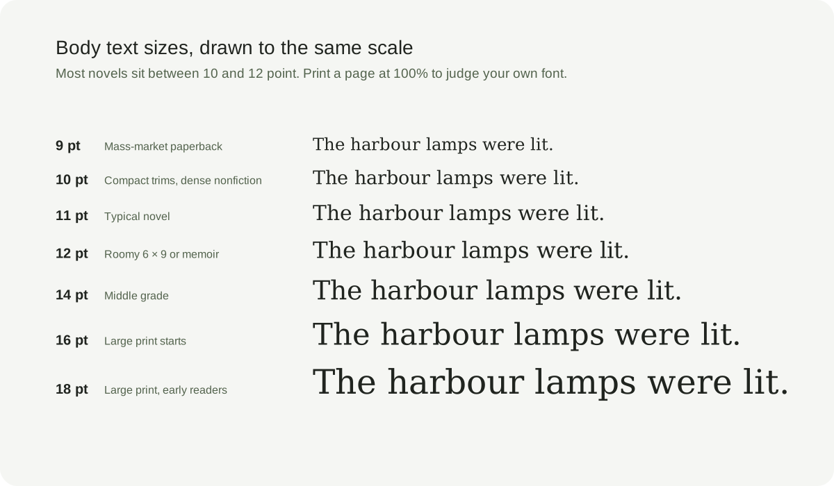
Word and Google Docs start you at 11 or 12 point on a letter-size page, which looks fine on a screen. On a 6 × 9 book page the same number can look large or small, depending on the font, the margins and the line spacing. Use the ranges below as a starting point, then judge a printed page rather than the number in the menu.
Typical font sizes by type of book
Adult fiction and most nonfiction are set between 10 and 12 point. Within that range, 11 point is a sensible first choice for a 6 × 9 or 5.5 × 8.5 paperback. Small pocket paperbacks often drop to 9 or 10 point, and roomy memoirs or literary novels sometimes use 12. Middle-grade books commonly use around 12 to 14 point. Early readers and picture books are larger again, and their layout usually follows the illustrations. Large-print editions start around 16 point. The table below gives working ranges, not rules.
Why 11 point looks bigger in one font than another
A point size measures the height of the box each letter sits in, not the letters themselves. Fonts with short lowercase letters, such as many Garamond designs, look smaller than Georgia or Times at the same setting. That is why 11.5 point in one book can feel the same as 10.5 point in another. Choose the font first, then adjust the size until the lowercase letters look comfortable on paper.
Set the line spacing with the size
Line spacing, also called leading, matters as much as the font size. For body text, 120 to 145 percent of the font size works well: 11 point type on lines of about 13 to 16 point. Too tight and the lines run together; too loose and paragraphs fall apart. Set exact spacing in points instead of Word's double or 1.5 lines, which suit manuscripts and reports rather than finished books.
Match the size to the width of the page
A comfortable printed line holds about 45 to 90 characters, including spaces, and most novels sit in the middle of that range. On a narrow 5 × 8 page, 10 to 11 point usually gets you there; on a 6 × 9 page, 11 to 12 point fits well. If a bigger size forces constant hyphenation or gappy justified lines, choose a larger trim or adjust the margins instead of squeezing the text. A bigger font also adds pages, which changes the spine width and the printing cost.
Manuscripts, print books and ebooks use different sizes
A manuscript for an agent or editor is usually 12 point and double-spaced, because it is meant to be read and marked up. Keep that format for submission and set the printed edition separately. In an ebook, readers choose their own text size, so leave body text at the default size instead of fixing a point size. Only the print edition needs a fixed body size.
Headings, running heads and page numbers
Chapter titles are usually much larger than the body, often around 18 to 30 point, while running heads and page numbers are a little smaller than the body. Keep footnotes and captions readable, usually one or two points below the body text. The goal is a clear order: chapter title first, then the text, then the quiet navigation around the page.
Check the size on paper before you publish
Print two facing pages at 100 percent on your trim size and hold them beside a published book you find comfortable to read. Compare the lowercase letters, the line spacing and the margins, not the number in the menu. Then order a printed proof. In Coverfairy's formatter you can switch themes, see real pages and the page count update, and carry the final count to the cover's spine.
Sources and verification
- Butterick's Practical Typography: point size
- Butterick's Practical Typography: line spacing
- Butterick's Practical Typography: line length
- Library of Congress NLS: large print materials
Requirements can change. Check the linked instructions before you publish or upload a file.
By Coverfairy Editorial · Published · Updated