

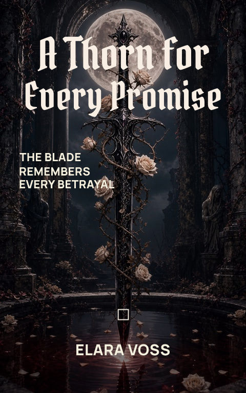
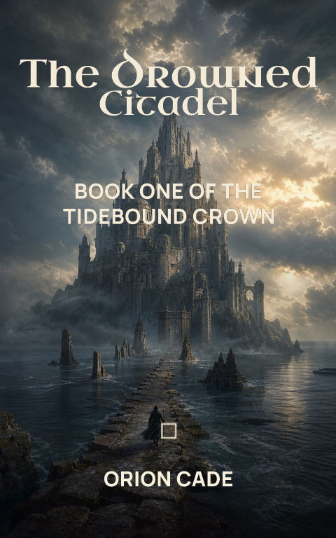
Ritual object
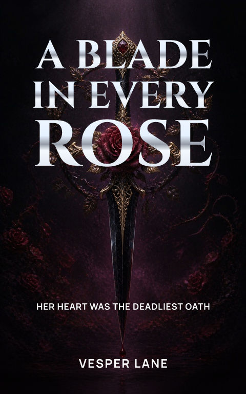
Light one object against a calm, near-black field.

Build around corruption, consequence, and supernatural threat. Start with eight distinct directions, then replace the art and edit every type layer.
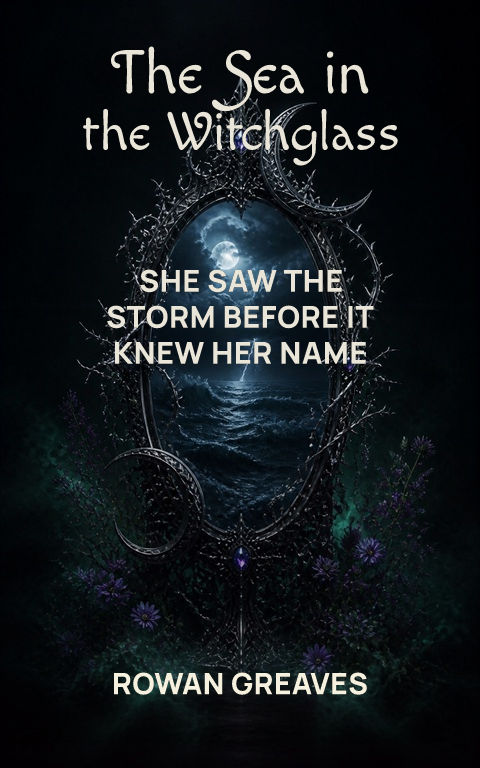
How do you make a dark fantasy book cover?Start from corruption, consequence, and supernatural threat, then keep the title, subtitle, author, and series lines as editable typography over replaceable artwork. A watermarked draft is free; an active pass unlocks the full-resolution ebook file, calculated KDP print wrap, and Interior exports.
Choose a template to open it with editable type and artwork.
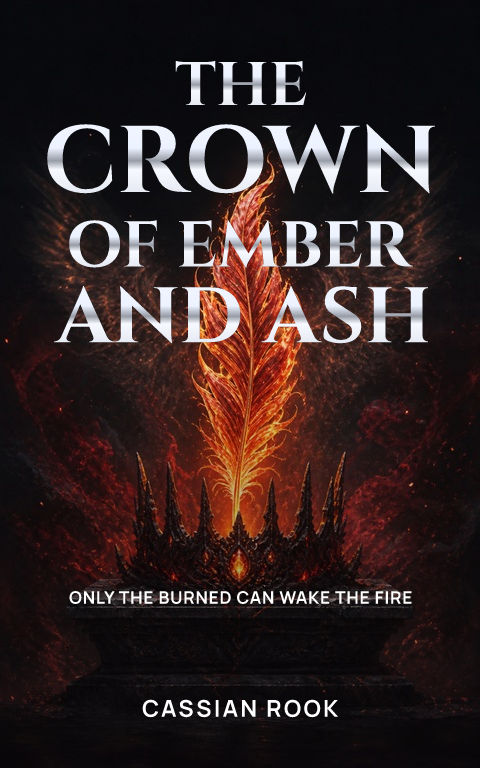
Dark fantasy needs menace, but a cover that is simply underexposed turns into a black rectangle in search results. Build darkness with selective contrast: a pale face, metallic relic, moon, flame, or saturated accent that creates a focal point. Texture should deepen the world without consuming the title field.
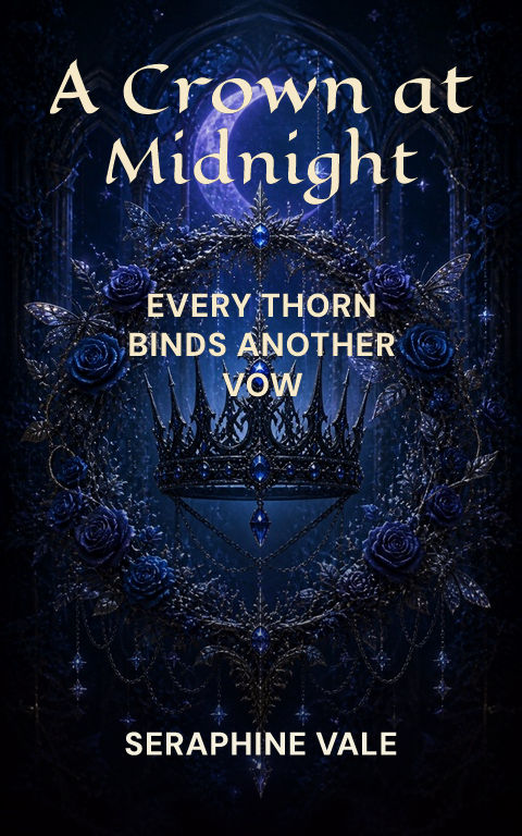
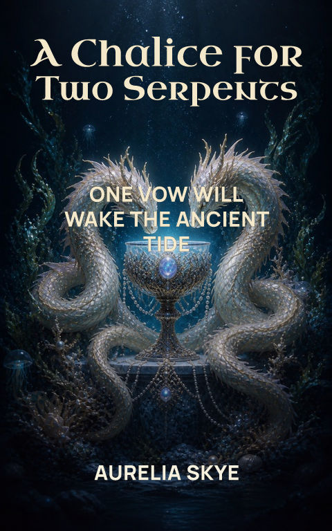
Gothic serifs, narrow capitals, and distressed details can establish tone. Use one of those signals, then give it enough negative space to stay readable. Red, bone, tarnished gold, and cold blue are effective accents because they separate from charcoal backgrounds at thumbnail size.
The back cover should not inherit the front's busiest detail. Extend fog, stone, forest, or gradient instead, preserving a clean reading column and barcode zone. Coverfairy previews that complete wrap while you edit the front.
Check the cover at storefront size: the title and focal image should still read clearly. For print, keep important details away from trim and leave a calm back-cover area for copy and barcode.
Light one object against a calm, near-black field.
Use side light and reserve the opposite side for type.
Let a single horizon or doorway create depth and threat.
The thumbnail check focuses on title contrast and focal separation.
Yes. Text shadow and artwork overlay controls are editable.
Yes. Both whole-studio passes include paperback and hardcover exports alongside the ebook cover and Interior files.