Useful book cover ideas begin with a reader promise and a compositional system, not a screenshot to imitate. Research how current covers signal genre, identify what is specific to your story, and combine those findings into several directions that can be judged at thumbnail and full size.
Where should book cover inspiration come from?
Build a reference set from current books aimed at the same reader, then widen it with photography, illustration, archives, objects, places, fashion, film composition, and period material relevant to the story. Label what you are responding to, scale, crop, palette, texture, type, or emotional distance, so inspiration becomes a decision rather than an instruction to copy.
Which genre patterns are worth tracking?
Record repeated title scale, type category, subject distance, image density, color relationships, and author hierarchy. Fantasy may divide between symbolic, character-led, and landscape systems; thrillers may use compressed portraits, isolated objects, or stark type; nonfiction often makes the promise and subject legible before atmosphere. Patterns change by subgenre, age category, and market.
How do you make a familiar idea original?
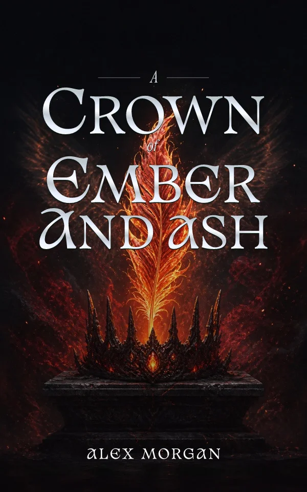
Connect the genre grammar to a manuscript-specific object, location, conflict, or relationship. Change the visual question rather than only changing the color. A crown can communicate inheritance, but the angle, condition, material, setting, and person refusing it can carry the actual story. Originality grows from specific meaning and deliberate execution.
How do you choose between cover directions?
Place each direction in a retailer grid beside relevant books. Test which one belongs to the correct shelf, remains identifiable as a small tile, and gives the title an intentional silhouette. Then inspect the full-size version for craft and the print adaptation for enough image area. Choose against a written brief so personal novelty does not outweigh reader clarity.
Work genre by genre, not shelf by shelf
Each category rewards different systems. Fantasy divides between symbol, character, and landscape structures; romance signals emotional temperature through illustration style and distance; thrillers compress toward isolation and withheld information; cozy categories add warmth and wit; practical nonfiction leads with the promise and subtitle. Study the three or four structures that dominate your exact subcategory and note which feel underused rather than exhausted.
Turn the research into testable directions
Convert the patterns into two or three deliberately different rough directions, perhaps one symbol-led, one scene-led, and one typographic, using your story's specific material in each. Rough comps at thumbnail size cost little and expose problems early: a concept that cannot survive as a small tile will not improve with rendering polish. Choose against the brief, then invest execution effort in the direction that won.
Fantasy: symbol, character, or landscape
Fantasy covers cluster into three systems. Symbol-led designs center a relic, sigil, crown, or botanical motif and travel well across a series. Character-led designs promise intimacy with a protagonist and suit romantasy and YA. Landscape systems promise scale: citadels, impossible geography, and small figures against enormous worlds. Choose by the book's dominant experience, then replace the default object with one that belongs to this story, an heirloom with a history, a map fragment of a place that matters, a sigil readers will learn to dread.
Romance: temperature before decoration
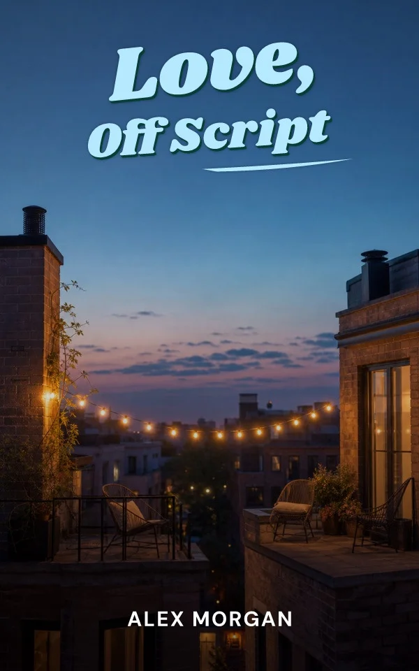
Romance readers decode heat and tone from style before reading a word. Bright flat illustration signals wit and contemporary warmth; painterly or photographic treatments signal drama, history, or higher heat; typographic and scenic covers suit literary and emotional narratives. The idea worth stealing is never the couple; it is the register. Decide what the relationship feels like in one sentence, then choose the medium and palette that make the same promise.
Thriller: withhold, isolate, compress
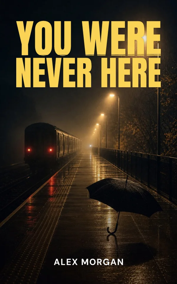
Thriller ideas work by subtraction. An emptied street, a figure walking away, a window lit in the wrong room, a pattern with one break: each implies danger without illustrating it. Restricted palettes and bold condensed type carry urgency at thumbnail size. Domestic suspense makes ordinary settings wrong; psychological thrillers fragment faces and reflections; pursuit stories use motion and landscape scale. Pick the shelf your manuscript actually sits on before borrowing its grammar.
Mystery and cozy: invite the reader to solve
Where thrillers warn, mysteries invite. Clue objects, closed rooms, village maps, and evidence-like collages reward curiosity, and cozy variants add illustrated warmth with one wrong detail, the tipped teacup, the shadow across the bakery floor. Series typography matters unusually much here because cozy readers buy by series identity. Historical and literary mysteries trade warmth for period texture and restraint, where one anachronistic typeface can undo the whole promise.
Science fiction: systems over spaceships
The most durable science-fiction cover ideas are structural: limited palettes, hard geometry, halftone texture, impossible scale, and assertive typographic blocks, the grammar of the genre's mid-century classics. Idea-driven fiction benefits from that conceptual confidence; fast-paced military or romance-led SF usually needs more contemporary signals. Either way, decide whether the promise is the idea or the momentum, and let that decision choose the register.
Children's: sell the child and the adult at once
A children's cover works twice or not at all. Expressive characters, visible emotion, and readable action attract the young reader; craft quality and age-appropriate signals reassure the buying adult. Picture books lead with one warm character moment; middle grade shifts toward adventure and world detail with more sophisticated type. Matching visual maturity to reading level is the fastest trust signal a parent gets, and the most common failure to check.
Nonfiction and self-help: the promise leads
Nonfiction ideas start with the reader outcome, not the imagery. Authority-led systems use scale and decisive type; concept-led systems change one familiar object so the argument becomes memorable; practical categories need the subtitle working as hard as the title. The strongest question to ask of any nonfiction cover idea: could a browsing reader state the book's promise from the cover alone at thumbnail size?
Memoir: the question, not the biography
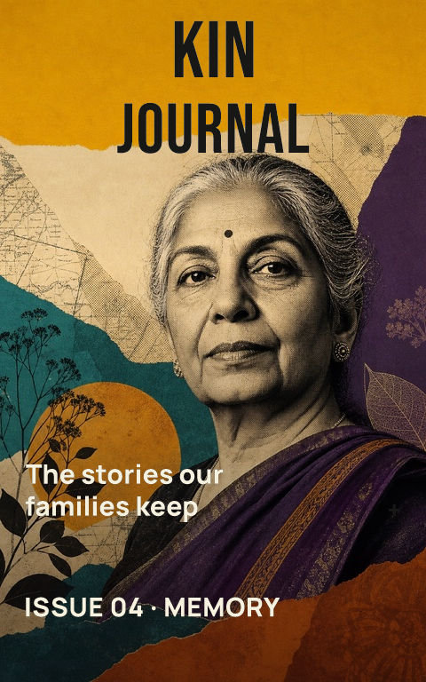
Memoir ideas succeed when they raise the question the book explores. An archival fragment, a place, an inherited object, an absence, expressive typography: each can invite a stranger into one life's specific tension without promising a complete biography. Portraits work when the face itself carries the story; otherwise the symbolic route usually creates the more precise invitation.
By Coverfairy Editorial · Published · Updated